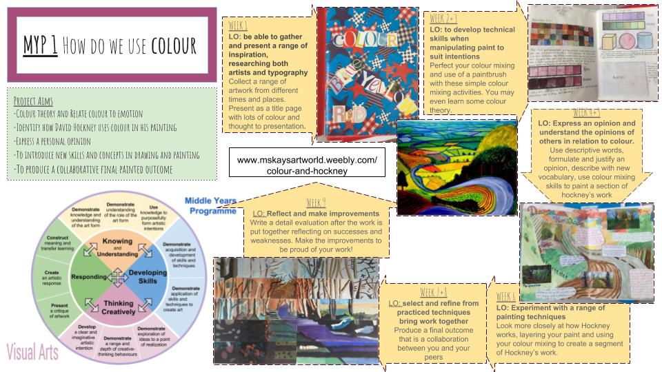
Learning Objectives
•Understand and explore basic colour theory
•Enrich subject specific vocabulary, knowledge and understanding
•Be able to recognise & discuss the work of David Hockney
•Learn about the application and use of water based paints, exploring different techniques
•Record and organise a range of visual evidence and information using a sketchbook
Project Aims
-To introduce the Art Department, encouraging good practice and conduct
-To introduce new skills and concepts in drawing and painting
-To produce a final painted outcome that combines the techniques students have learnt
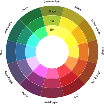
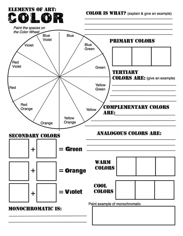
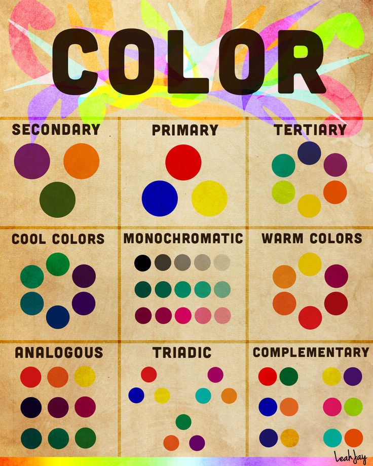
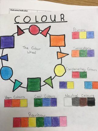
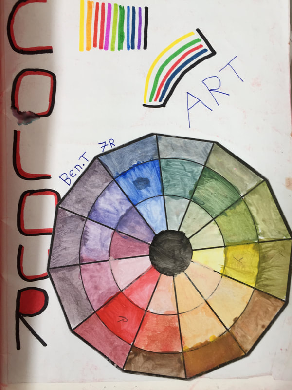
the colour wheel
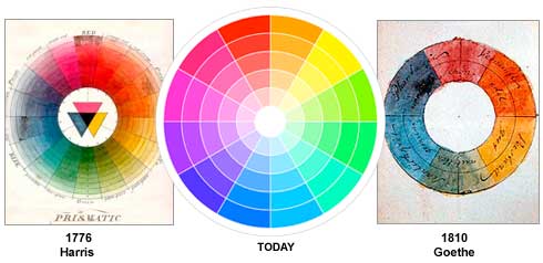
A colour circle, based on red, yellow and blue, is traditional in the field of art. Sir Isaac Newton developed the first circular diagram of colours in 1666. Since then, scientists and artists have studied and designed numerous variations of this concept. Differences of opinion about the validity of one format over another continue to provoke debate. In reality, any colour circle or colour wheel which presents a logically arranged sequence of pure hues has merit.
|
|
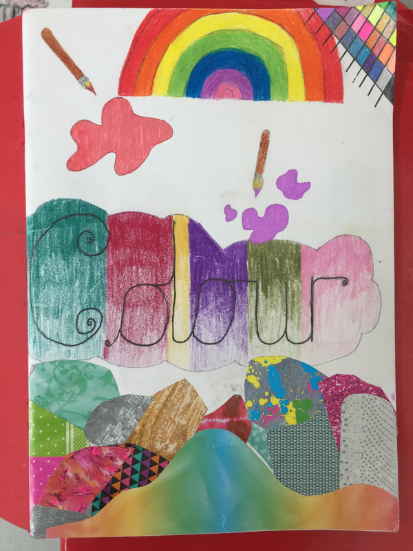
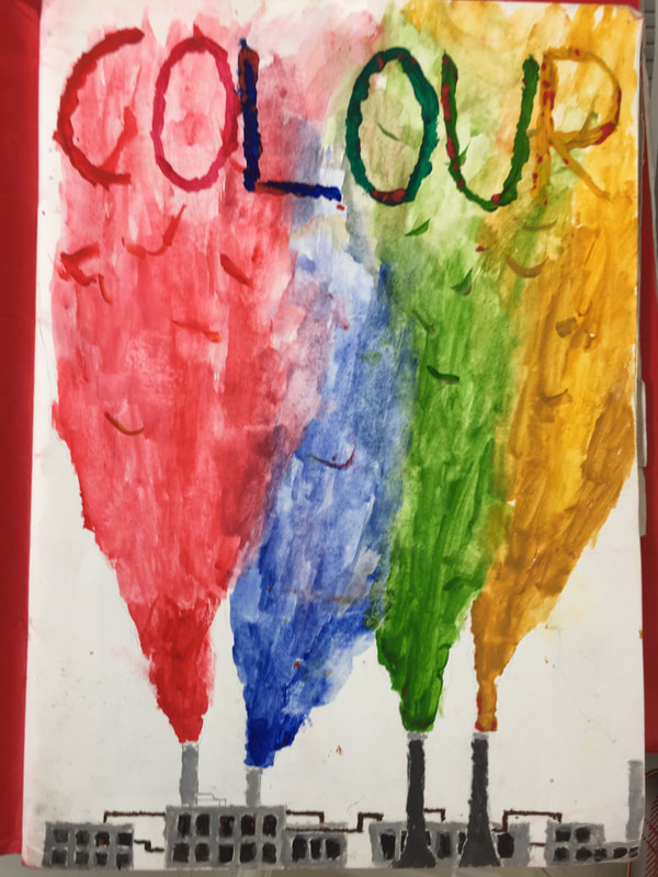
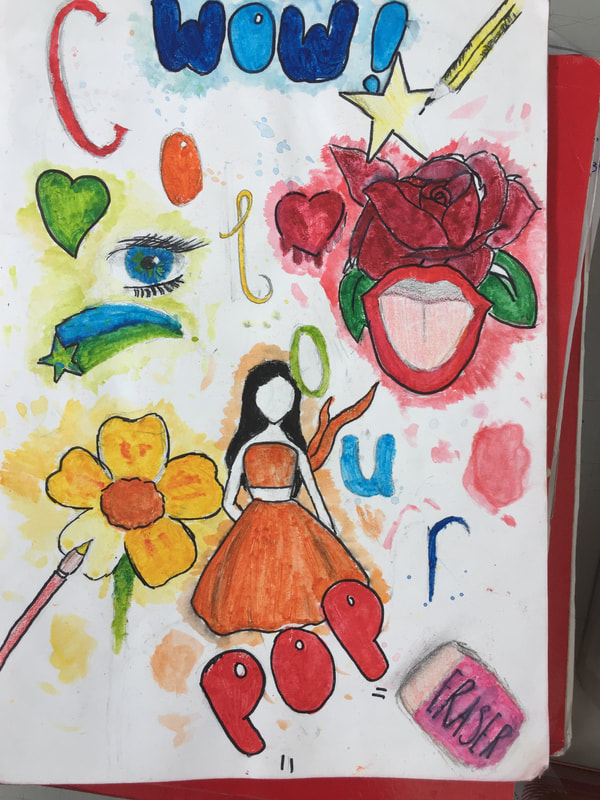
HOMEWORK - CREATE A TITLE PAGE THAT DEMONSTRATES YOUR KNOWLEDGE OF COLOUR
You could create and label a colour wheel (paint it, pencil crayon, collaged papers)
You could Recreate a colourful famous artwork and label the sorts of colours used.
You could fill the word 'Colour' with different colour scheme and explain what you did.
You could create and label a colour wheel (paint it, pencil crayon, collaged papers)
You could Recreate a colourful famous artwork and label the sorts of colours used.
You could fill the word 'Colour' with different colour scheme and explain what you did.
student's colour title pages

how hockney works
artist research
Find Examples of David Hockney's work. Find your Favorite Artwork and write a review.
Artwork Research
1. Put the name of the Artist and the Artwork as your title
2. Print out one Art work and glue it on the page
3. Write down when the work was made and where the artist was from and which art movement it was.
4. Now you need to talk about the work...
describe it.
• What do you see in this picture? What else do you see?
• What words would you use to describe this painting? What other words might we use?
• What does this image show?
• How would you describe the lines in this picture? The colors?
• How would you describe this picture to a person who hasn’t seen it?
• How would you describe the objects in this picture? Is it like real life? How is it different?
relate it.
• What things do you recognize in this work of art?
• What does this art work remind you of?
• How is this image like some other artwork you have seen? How is it different?
• How is this picture different from real life?
• What interests you most about this work of art?
analyze SHAPE
• What shapes seem closest to you? Further away?
Composition (organisation of shapes):
-what type of shapes are used in this artwork (i.e. rounded, curved, straight-edged or geometric shapes)?
-Is there a mixture of different types of shapes or are all the shapes similar?
-Are some parts of the composition full of shapes and some parts empty, or are the shapes spread evenly across the artwork?
-Are some shapes repeated or echoed in other parts of the artwork?
-Does the whole composition look full of energy and movement, or does it look still and peaceful? How did the artist create this movement/stillness?
- What is the center of interest in the composition?
-How does the artist draw your attention to it?
analyze COLOUR
o which type of palette has the artist used: is it bright or dull, strong or weak?
o are the colours mostly complementary, primary, secondary or tertiary
o Which colour(s) are used most in this artwork?
o Which colour(s) are used least in this artwork?
o Are the colours used different ways in different parts of the artwork?
o Have the colours been applied flat, ‘straight from the tube’, or have different colours been mixed?
interpret it.
• What can you tell us about the landscape in this painting?
- How does it make you feel and what makes you feel that way?
• What do you think this painting is about? Why do you think that?
• Why do you think the artist made this painting?
evaluate it.
Based upon what you have observed already, give your opinion of the artwork. You MUST give reasons.
Eg:
o “Franz Marc has created an effective expressive painting, because the hot colours and lively brushmarks he has used add to the overall feeling of energy and excitement he is trying to create.”
o “The overall mood of this drawing would be improved if Kathe Kollowitz had used strong, dramatic shadows, instead of just pale tones. Dark tones would develop the feeling of fear and loneliness in this image.”
o “Picasso has used sharp, stabbing, geometric shapes in some areas of his composition to create a sense of violence and distress within ‘Guernica’. These make the figures and animals seem more vulnerable, as if in pain and suffering while under attack.”
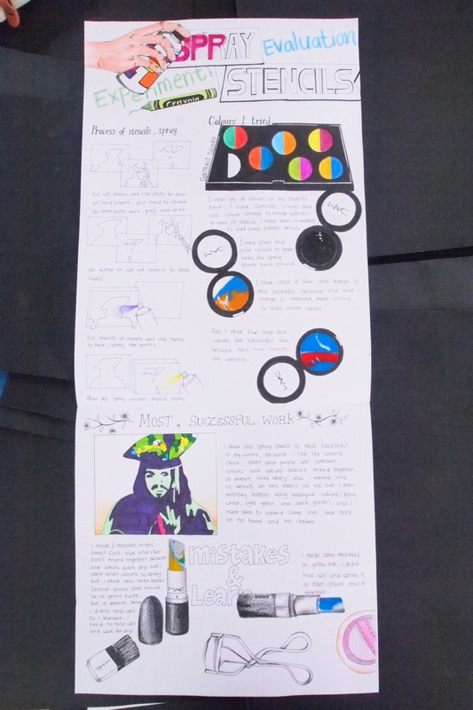
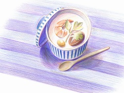
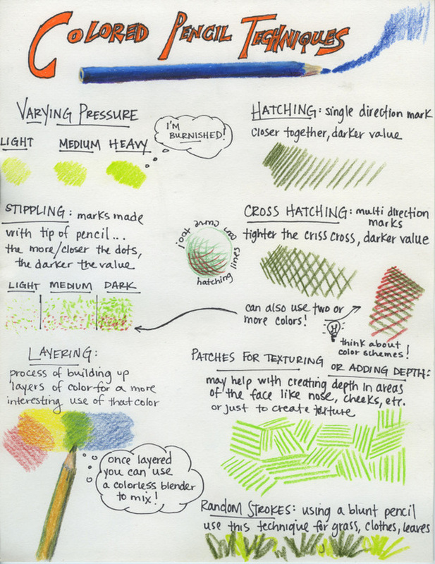
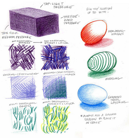
Experiment with coloured pencils
LO: Use a range of mark making techniques to experiments with different effects of coloured pencils
Making the most of Colored pencils
TIP #1-" Color Heavy"- or at least build up your color gradually so that the colors are intense and complex. Don't rely on the value of your paper to make your tints and shades.
TIP #2- "Layer Your Colors"- Build up many layers of your colors. Do not rely on just one application of color to bring you success. Building up and layering your colors will make your colors more complex and realistic.
TIP #3-"Mix Your Colors"- When using any colored medium, you should ALWAYS mix colors. Colored pencils are no different. For example, if you are drawing grass, don't just grab that manufactured green. Instead use blue and yellow, and green.
TIP #4- "Outline Last"- If you like to outline, wait and do it when you are finished drawing the object. Colored pencils can overlap themselves very easily, enabling you to outline objects last. (Don't use black to outline)
TIP #5- "Take Your Time"- Colored Pencils are a medium that demands time. You must work deliberately. It takes time to craft a well-drawn colored pencil image.
TIP#6- "Burnish"- By taking a white colored pencil or a colorless blender, smooth the colors and values out to make a consistent texture and solid finish.
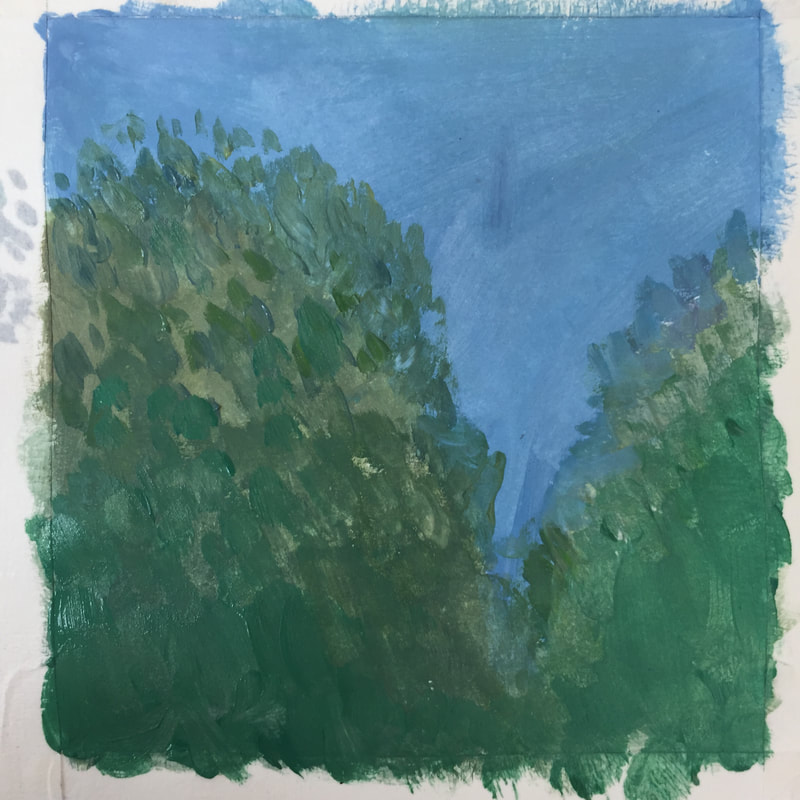
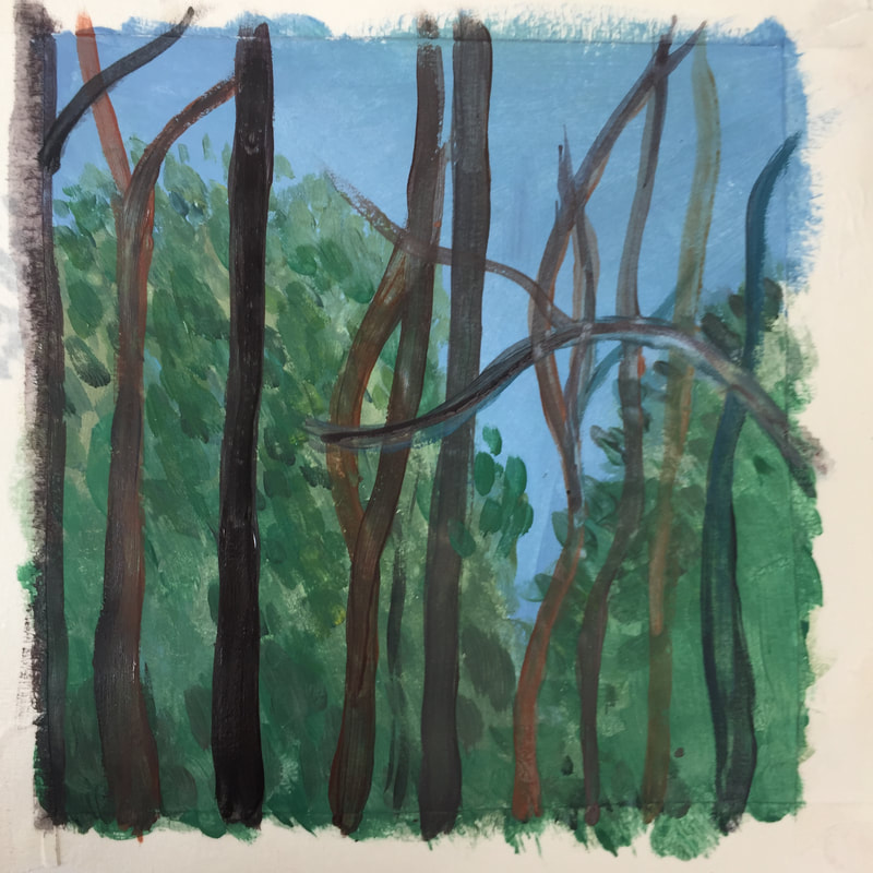
Hockey tester page
Get practicing painting like Hockney. use half your page for practices then the other to try a quick recreation of a segment of his work. Don't forget to focus on:
Colour mixing - test the colours before you apply and look at tints and tones
Paintbrush control - which size and how much contact with the paper when
Layer - Build the painting, painting underneath first and layering colours over each other
Mark-making - look at all of the visible brush strokes Hockney uses. try this!
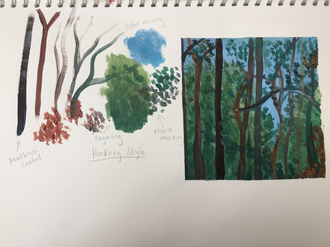
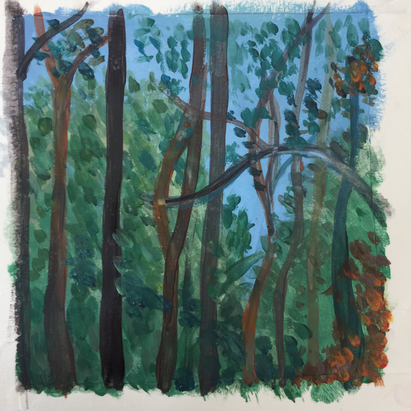
building your painting
|
|
|
