Task list for this Project:
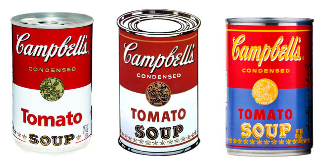
HOMEWORK - Pop Art Style Front Cover + bring in an interesting example of packaging
SKETCHBOOK WORK
- Take notes on the POP ART PPT on SHAPE
- Analyze how shape is used in your favorite Pop Art Piece
-Experiment with different colored pencil techniques whilst breaking down objects into simple shapes
- Spray Paint Experiments and process
STUDIO WORK
- Pencil sketch of POP ART PACKAGING object
- Cut Stencils and make a series of Pop Art Spray Paints - choosing your best.
SKETCHBOOK WORK- Take notes from PPT ON POP ART on COLOUR
- write an analysis of color use in a Pop Artist’s work.
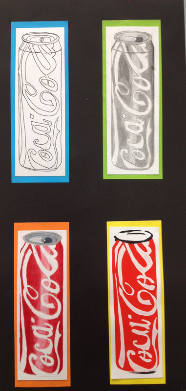
- Experiment with Line Drawing Techniques - Blind, continuous and Contour using a colour pallet
- Experiment with water colour and add a line drawing technique over the top
STUDIO WORK
- Use your new skills to make a waster color Pop Art packaging Piece
- Photograph packaging and use photoshop to make a Lichtenstein inspired digital piece
HOMEWORK - Pop Art Style Front Cover + bring in an interesting example of packaging
SKETCHBOOK WORK
- Take notes on the POP ART PPT on SHAPE
- Analyze how shape is used in your favorite Pop Art Piece
-Experiment with different colored pencil techniques whilst breaking down objects into simple shapes
- Spray Paint Experiments and process
STUDIO WORK
- Pencil sketch of POP ART PACKAGING object
- Cut Stencils and make a series of Pop Art Spray Paints - choosing your best.
SKETCHBOOK WORK- Take notes from PPT ON POP ART on COLOUR
- write an analysis of color use in a Pop Artist’s work.
- Experiment with Line Drawing Techniques - Blind, continuous and Contour using a colour pallet
- Experiment with water colour and add a line drawing technique over the top
STUDIO WORK
- Use your new skills to make a waster color Pop Art packaging Piece
- Photograph packaging and use photoshop to make a Lichtenstein inspired digital piece
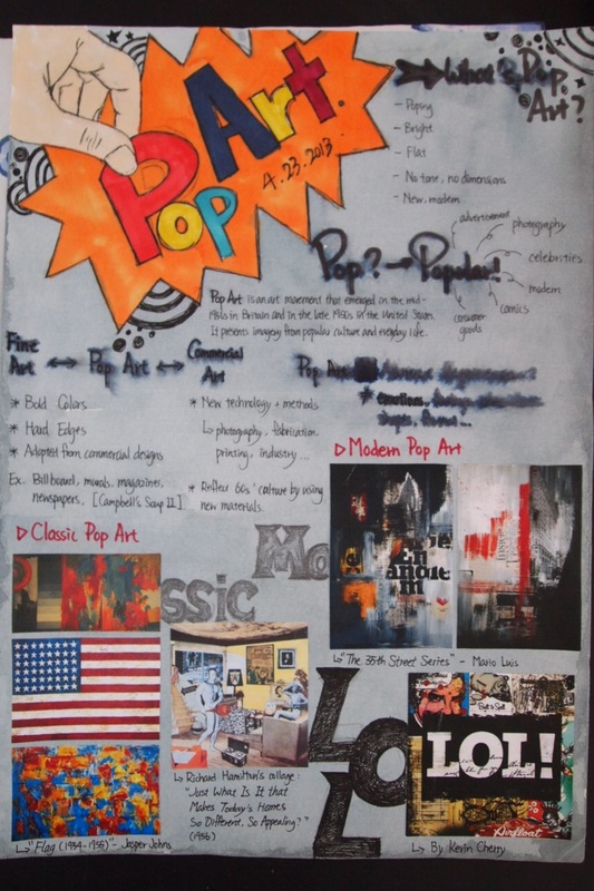
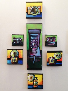
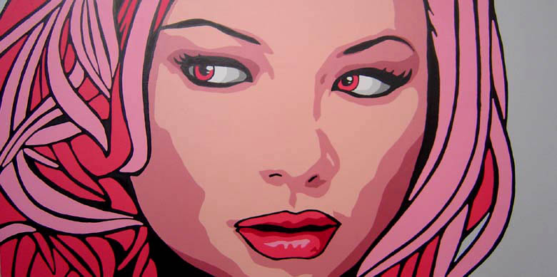
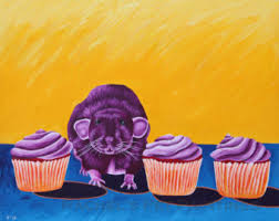
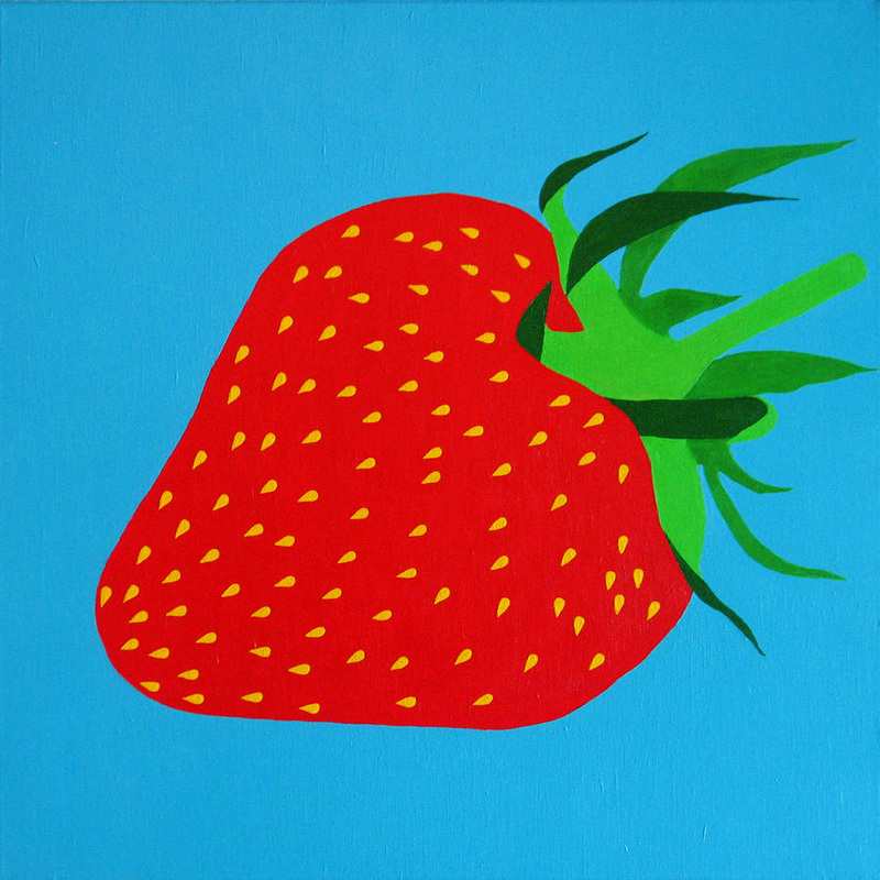
student's Pop Art Pages


LO: Understand and Identify which shapes are used and how in Pop Art
-Analyze the use shapes used in a certain artwork and interpret a meaning
-Analyze the use shapes used in a certain artwork and interpret a meaning
Pop Art Intro PPT
more on Pop Art Artists
Introduction to colour through Pop Art
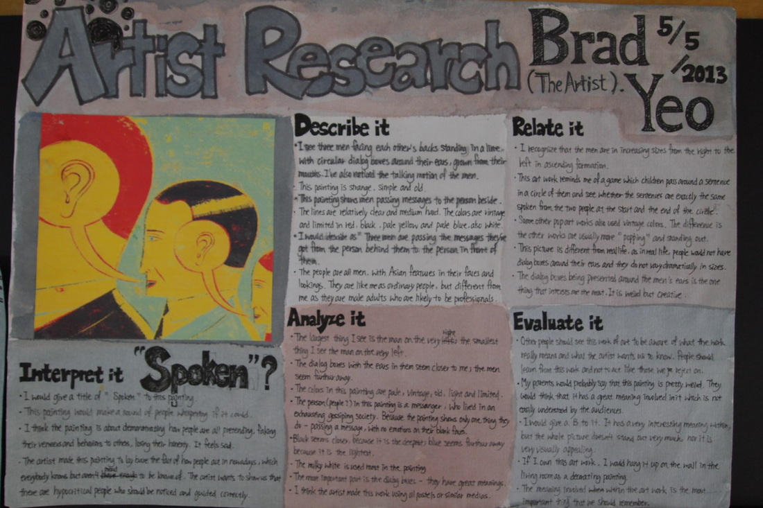
artist research
Choose a Pop Artist that studies the same theme as you. Find your Favorite Artwork and write a review.
Artwork Research
1. Put the name of the Artist and the Artwork as your title
2. Print out one Art work and glue it on the page
3. Write down when the work was made and where the artist was from and which art movement it was.
4. Now you need to talk about the work...
describe it.
• What do you see in this picture? What else do you see?
• What words would you use to describe this painting? What other words might we use?
• What does this image show?
• How would you describe the lines in this picture? The colors?
• How would you describe this picture to a person who hasn’t seen it?
• How would you describe the object in this picture? Is it like real life? How is it different?
relate it.
• What things do you recognize in this work of art?
• What does this art work remind you of?
• How is this image like some other artwork you have seen? How is it different?
• How is this picture different from real life?
• What interests you most about this work of art?
analyze SHAPE
• What is the largest and the smallest shapes you see?
• What shapes seem closest to you? Further away?
Composition (organisation of shapes):
-what type of shapes are used in this artwork (i.e. rounded, curved, straight-edged or geometric shapes)?
-Is there a mixture of different types of shapes or are all the shapes similar?
-Are some parts of the composition full of shapes and some parts empty, or are the shapes spread evenly across the artwork?
-Are some shapes repeated or echoed in other parts of the artwork?
-Does the whole composition look full of energy and movement, or does it look still and peaceful? How did the artist create this movement/stillness?
- What is the center of interest in the composition?
-How does the artist draw your attention to it?
analyze COLOUR
o which type of palette has the artist used: is it bright or dull, strong or weak?
o are the colours mostly complementary, primary, secondary or tertiary
o Which colour(s) are used most in this artwork?
o Which colour(s) are used least in this artwork?
o Are the colours used different ways in different parts of the artwork?
o Have the colours been applied flat, ‘straight from the tube’, or have different colours been mixed?
interpret it.
• What can you tell us about the person/object in this painting/print?
• What do you think this painting/print is about? Why do you think that?
• Why do you think the artist made this painting/print?
evaluate it.
Based upon what you have observed already, give your opinion of the artwork. You MUST give reasons.
Eg:
o “Franz Marc has created an effective expressive painting, because the hot colours and lively brushmarks he has used add to the overall feeling of energy and excitement he is trying to create.”
o “The overall mood of this drawing would be improved if Kathe Kollowitz had used strong, dramatic shadows, instead of just pale tones. Dark tones would develop the feeling of fear and loneliness in this image.”
o “Picasso has used sharp, stabbing, geometric shapes in some areas of his composition to create a sense of violence and distress within ‘Guernica’. These make the figures and animals seem more vulnerable, as if in pain and suffering while under attack.”
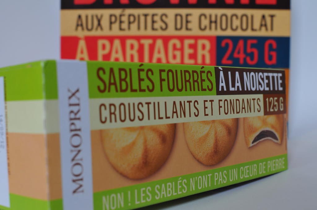
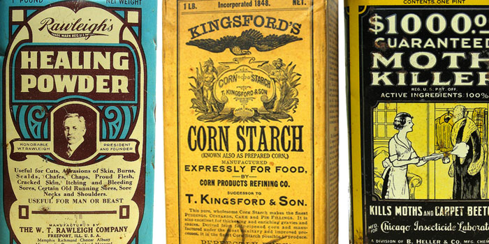
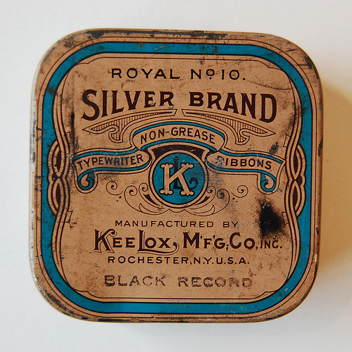
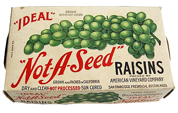
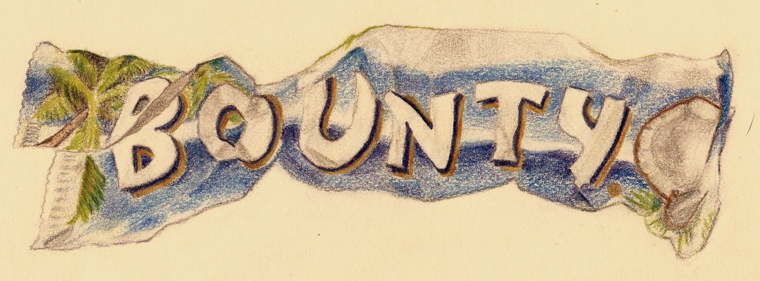
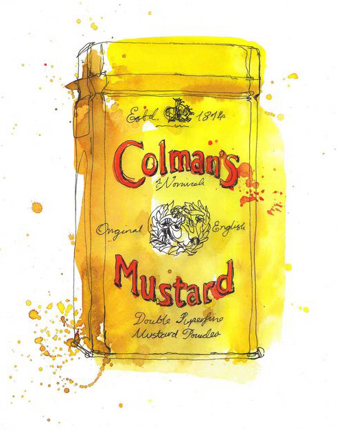
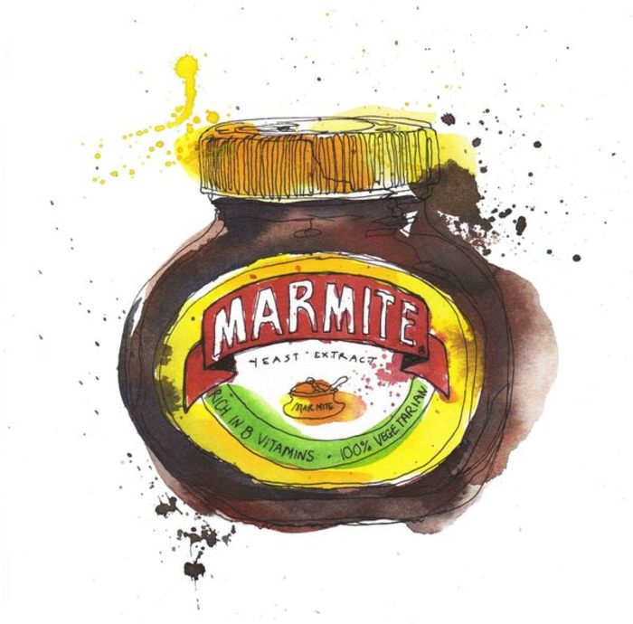
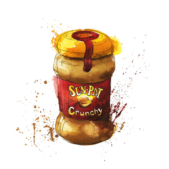
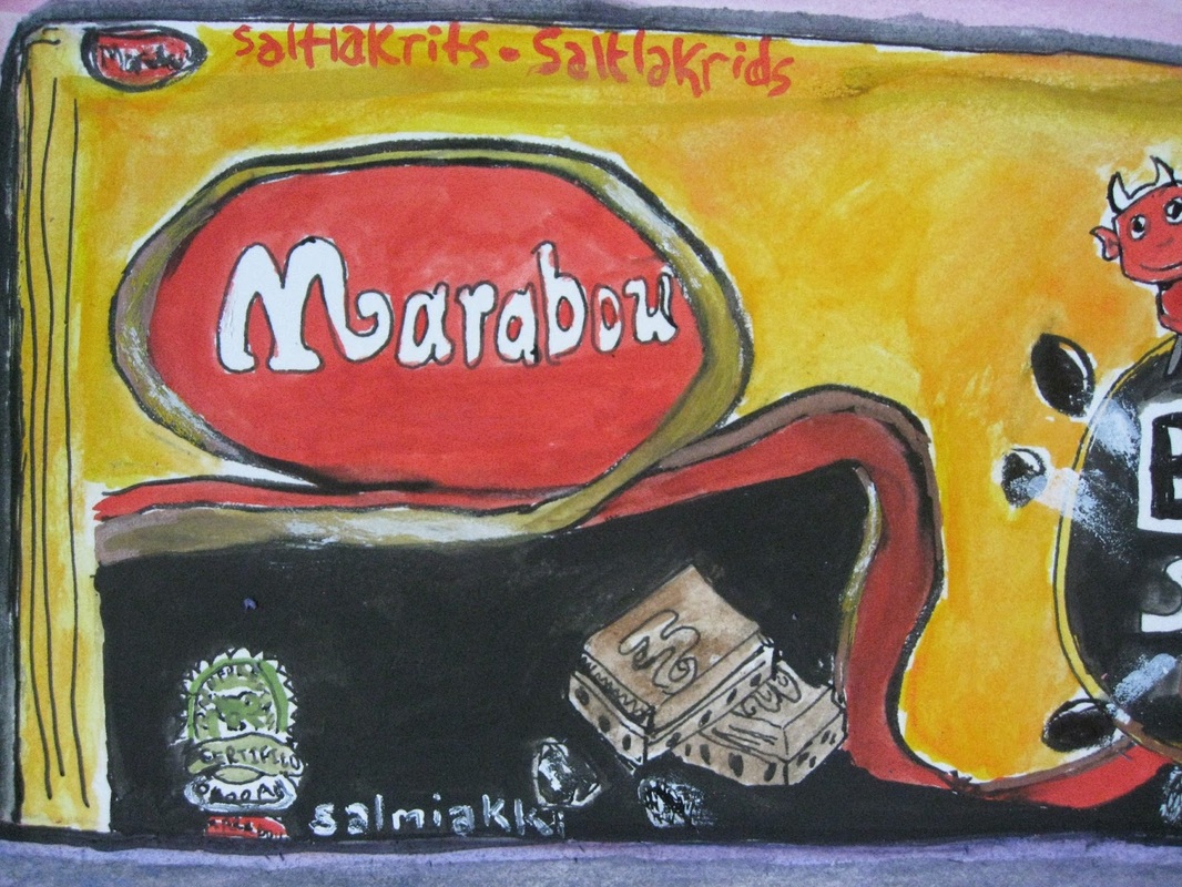
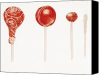
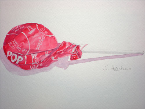
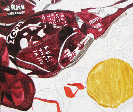
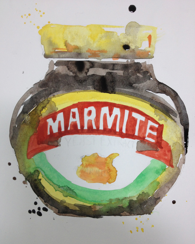
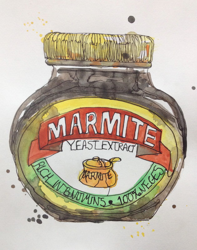
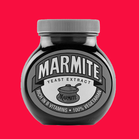
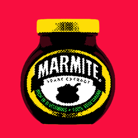
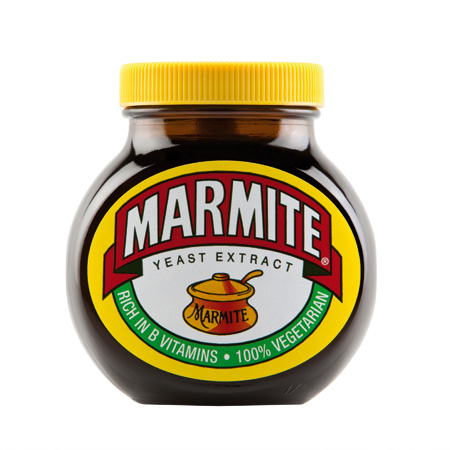
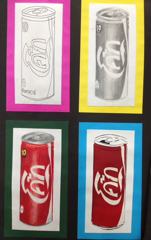
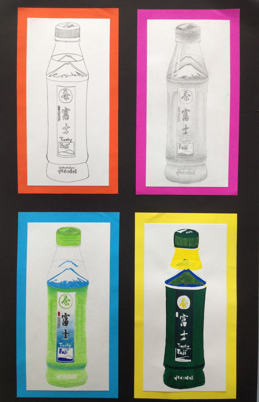
interesting packaging
Find some packing from home. The kitchen is a good place to start. Food. Drinks. Cleaning products. take away containers. Anything with a Brand and writing that reflects the day we live in.
|
|
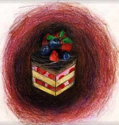
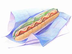
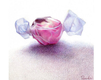
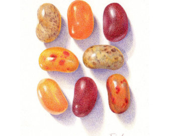
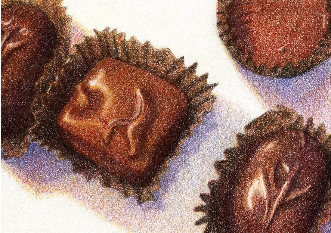
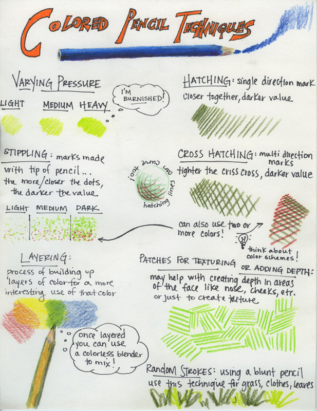
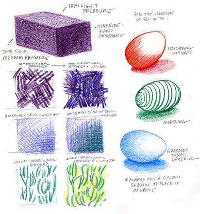
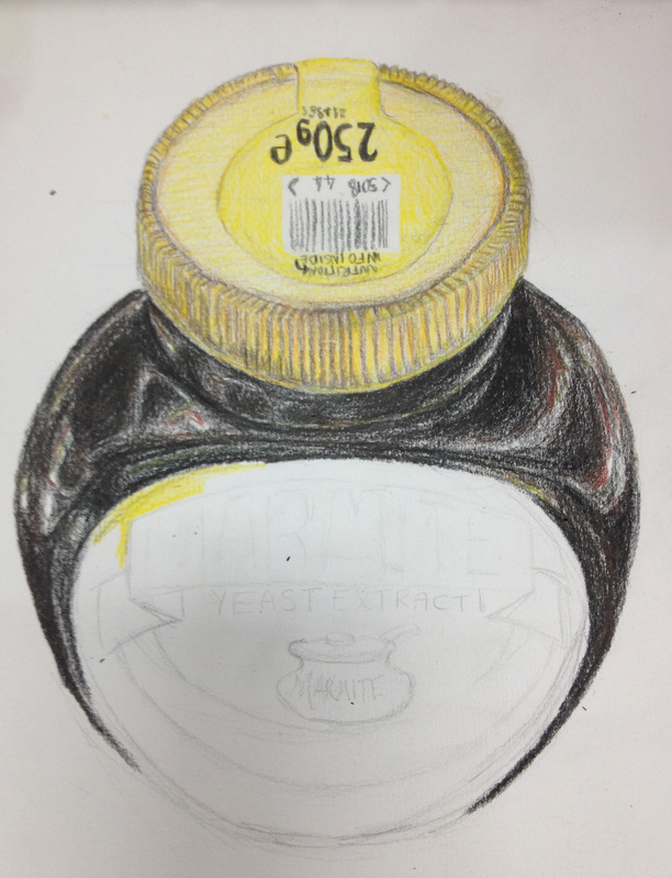
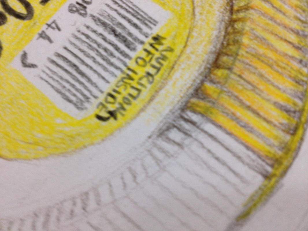
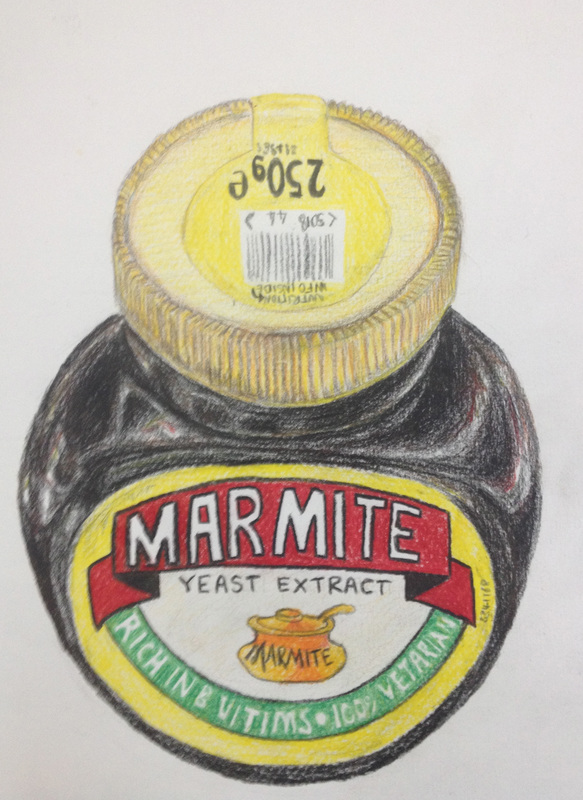
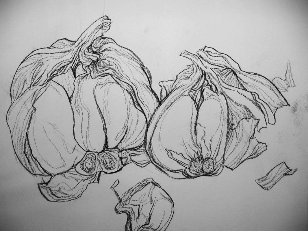
Experiment with coloured pencils
LO: Use a range of mark making techniques to experiments with different effects of coloured pencils
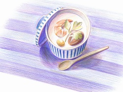
Making the most of Colored pencils
TIP #1-" Color Heavy"- or at least build up your color gradually so that the colors are intense and complex. Don't rely on the value of your paper to make your tints and shades.
TIP #2- "Layer Your Colors"- Build up many layers of your colors. Do not rely on just one application of color to bring you success. Building up and layering your colors will make your colors more complex and realistic.
TIP #3-"Mix Your Colors"- When using any colored medium, you should ALWAYS mix colors. Colored pencils are no different. For example, if you are drawing grass, don't just grab that manufactured green. Instead use blue and yellow, and green.
TIP #4- "Outline Last"- If you like to outline, wait and do it when you are finished drawing the object. Colored pencils can overlap themselves very easily, enabling you to outline objects last. (Don't use black to outline)
TIP #5- "Take Your Time"- Colored Pencils are a medium that demands time. You must work deliberately. It takes time to craft a well-drawn colored pencil image.
TIP#6- "Burnish"- By taking a white colored pencil or a colorless blender, smooth the colors and values out to make a consistent texture and solid finish.


|
|
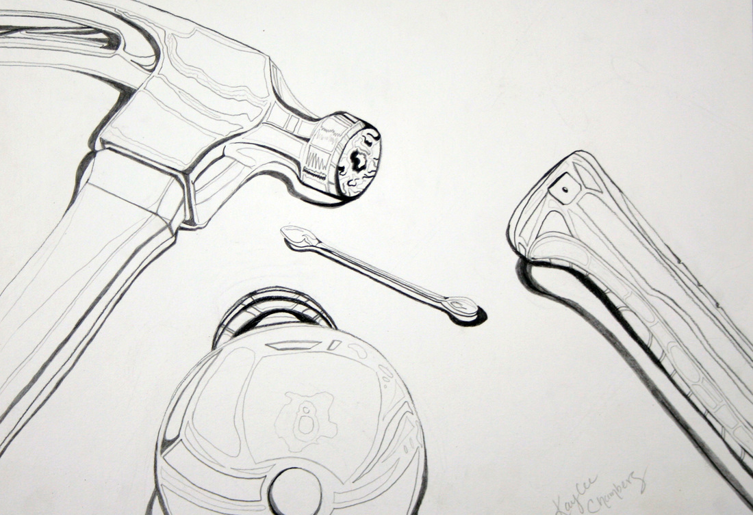
Shape and Proportion
LO: Practice creating the correct shapes and proportions of objects
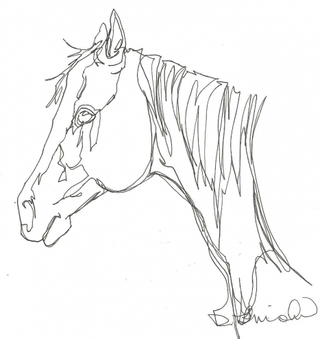
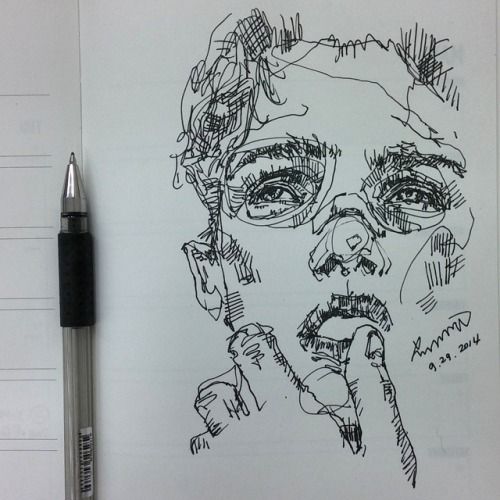
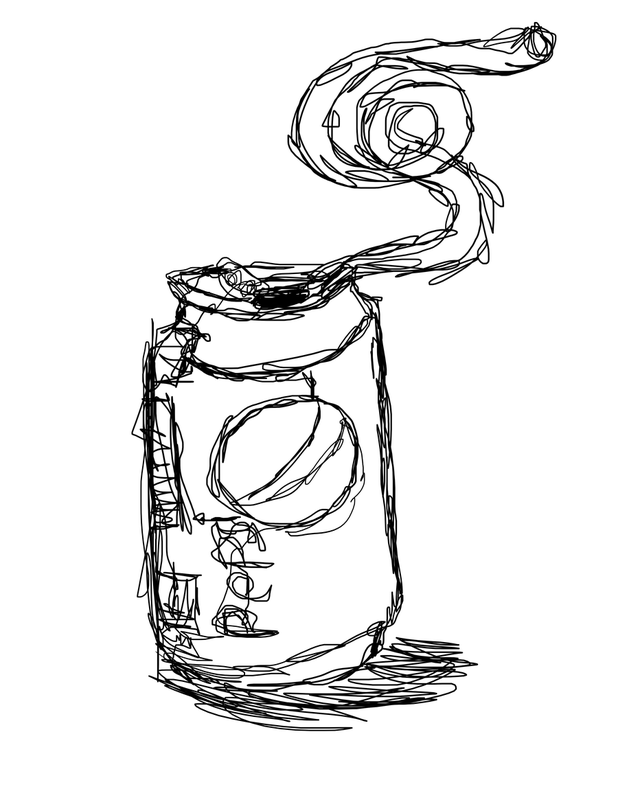
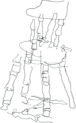
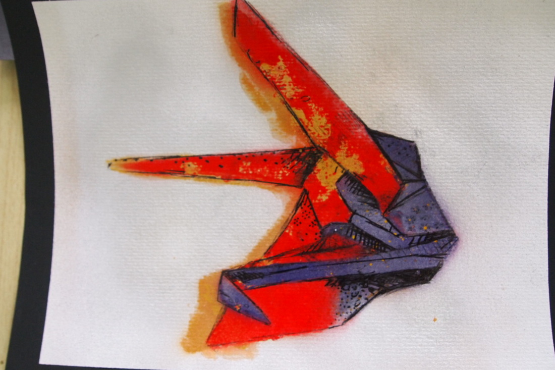
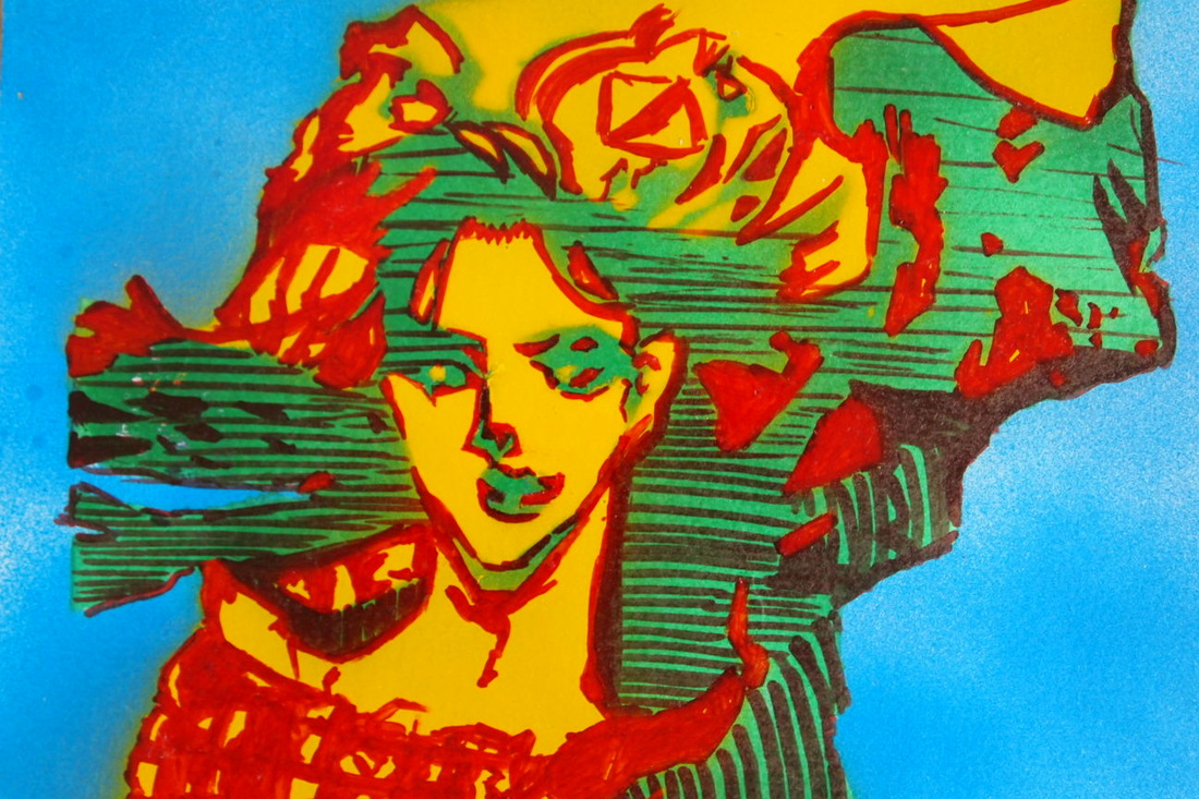
Line drawing techniques
LO: Use a range of mark making techniques to experiment with different ways to make lines
-Be free to make mistakes and understand that ‘not accurate’ can ‘look good’
-Be free to make mistakes and understand that ‘not accurate’ can ‘look good’
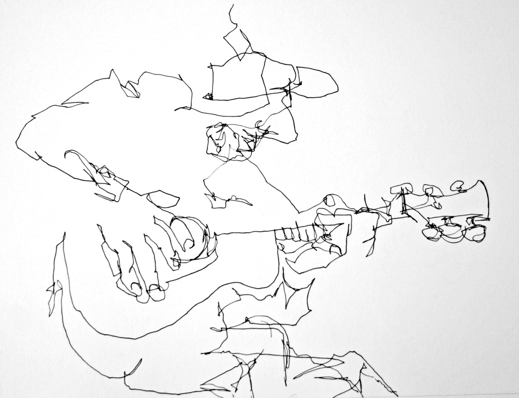
Continuos line drawing - Try drawing without taking your en off the paper - not once! Try to capture tones and form (make it look 3d)
|
|
|
Blind Drawing - Now only look at the object you're drawing, hide your paper. Don't cheat!

|
|
|
Contour line - Think about a map, how are mountains shown? Show the 3d form of a shape using think and thin lines
|

|
|
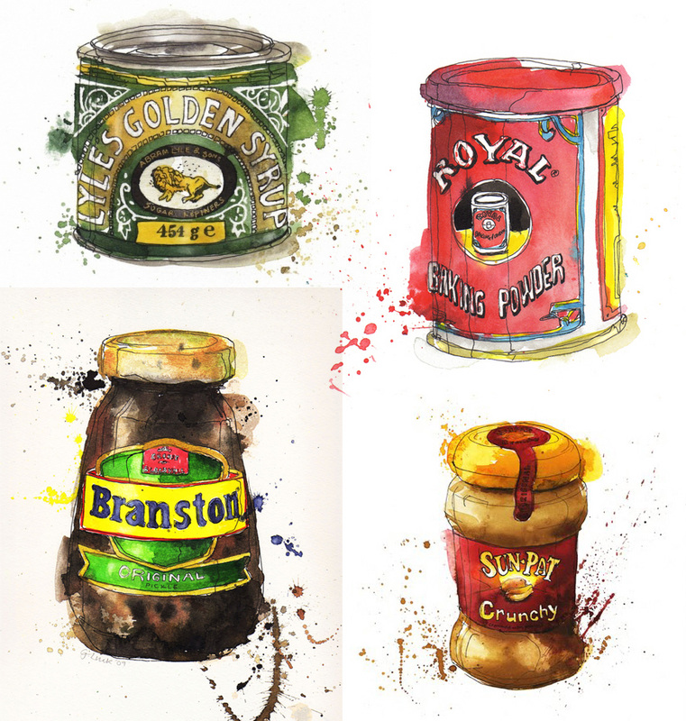
a Watercolour mess
LO: Develop a freedom in watercolor use. Apply quick and minimal movements to let colours blend to desired effect

Making the Most of Water colour - less is more!
- Practice makes perfect" is the phrase you need to remind yourself of when you start painting.
- Watercolor paper or card stock works a lot better than regular printer paper. Thin papers will buckle and curl up, they may not ever dry flat. Watercolor paper of the same weight will flatten more when it's dry than card stock, it's sized to give it a different texture.
- "Trial and Error" means that you experiment and try things to find out what happens. A failed trial does not mean you're a bad painter or a bad person or have no talent. It means that technique produced that result - and it might be exactly right for a different painting! You did not fail. That technique didn't work as you expected it to, but now you know what'll happen if you do it.
- Too much water and brushing in one spot will make your paper tear and fall apart. Sometimes, it's best to let the paint dry and begin painting again. If you're really in a hurry use a hairdryer, but take care - it can cause the paint to run.
- Always sign your work. This is very important. You never know whose hands it could end up in. Date it on the back so that you can see your progress and understand how much you've learned.
- If you find that painting is your niche, stick with it and have patience.
|
|
Color Theoryنظريات الدائرة اللونية (لمحة سريعة) اتمنى لطلاب الفنون الاستفادة
Posted by Muhyidden Falioun on Thursday, 11 February 2016
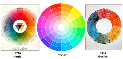
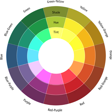
the colour wheel
A color circle, based on red, yellow and blue, is traditional in the field of art. Sir Isaac Newton developed the first circular diagram of colors in 1666. Since then, scientists and artists have studied and designed numerous variations of this concept. Differences of opinion about the validity of one format over another continue to provoke debate. In reality, any color circle or color wheel which presents a logically arranged sequence of pure hues has merit.
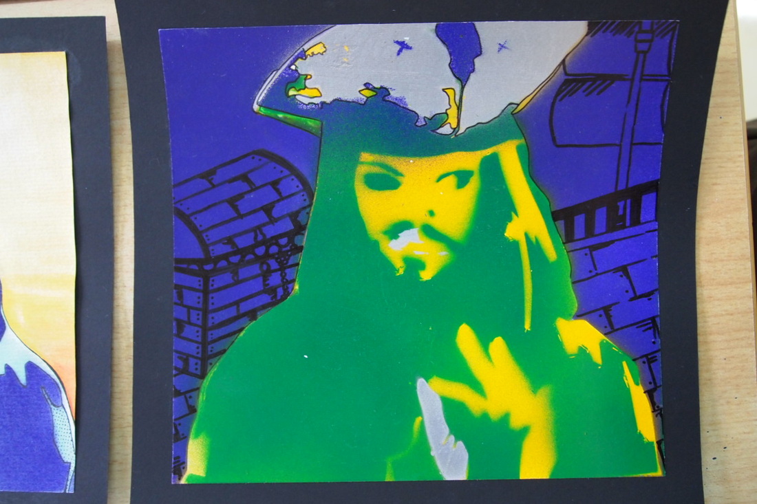
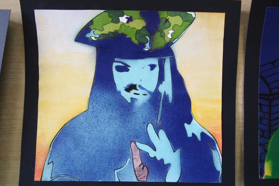
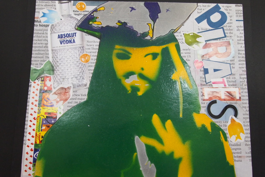
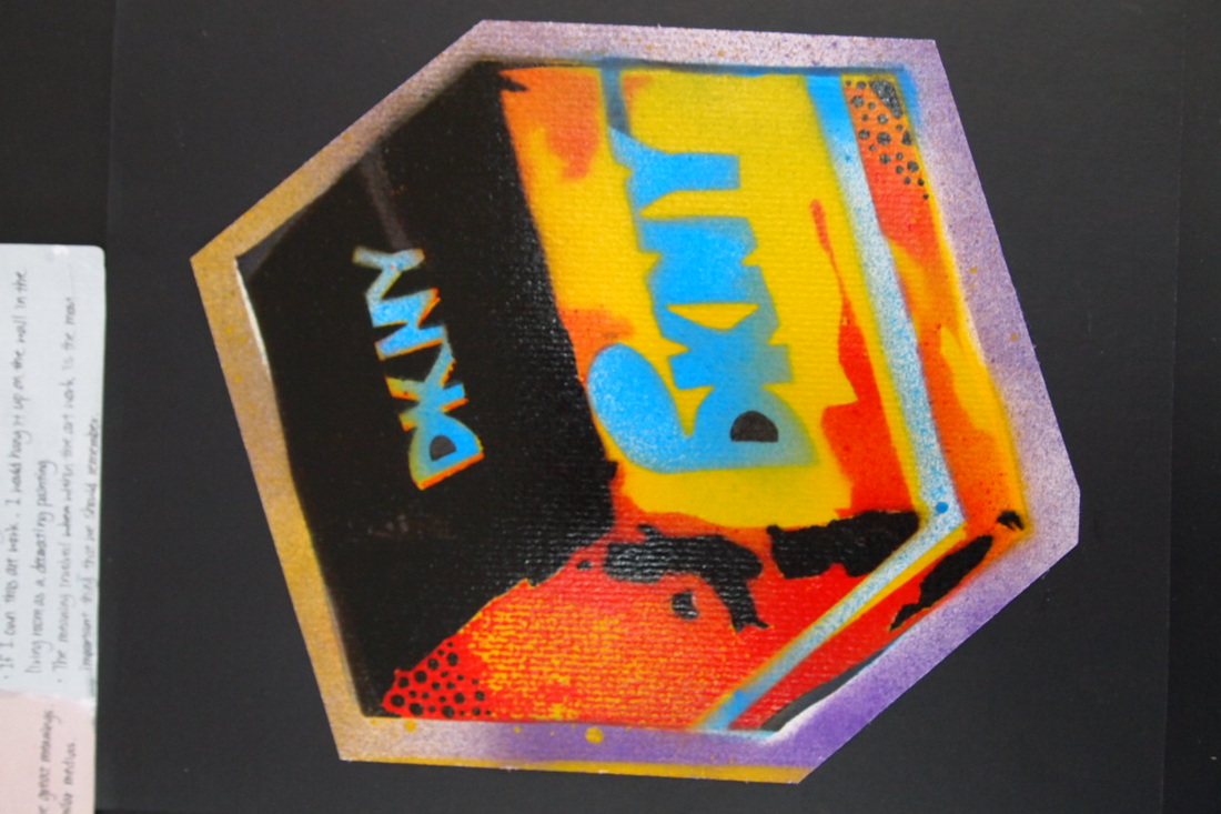
How to roy lichtenstien your work in photoshop
LO: Understand and follow from verbal and written instructions on the use of multimedia work
Experiment with your colors, applying different colors to parts
Explain the color scheme you have used
Experiment with your colors, applying different colors to parts
Explain the color scheme you have used
|
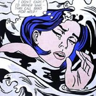
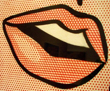
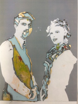
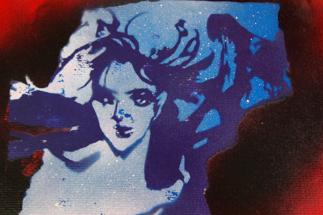
If you are a fan of pop art then you’re probably already well acquainted with the work Roy Lichtenstein. Roy Lichtenstein became one of the leading pop artists of the sixties with his comic-strip paintings. Drowning Girl 1963, shown left, is one of his better known works and is a good example of the design features in his most famous pieces. Notice the thick lines, bold colors, and thought bubble. His work also often included boxed captions and words such as “WHAAM!”, commonly found in comic books.
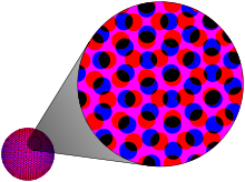
Benday dots were Lichtenstein’s trademark. Benday dots are a printing process which combines two (or more) different small, coloured dots to create a third colour. Back in the day, pulp comic books used benday dots in primary colours to inexpensively create the secondary colours such as flesh tone. You can create the benday dot effect by using the Colour Halftone filter found in Adobe Photoshop |
|

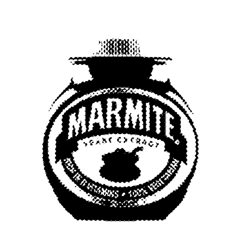

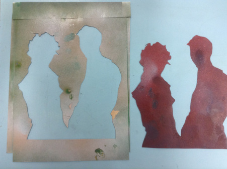
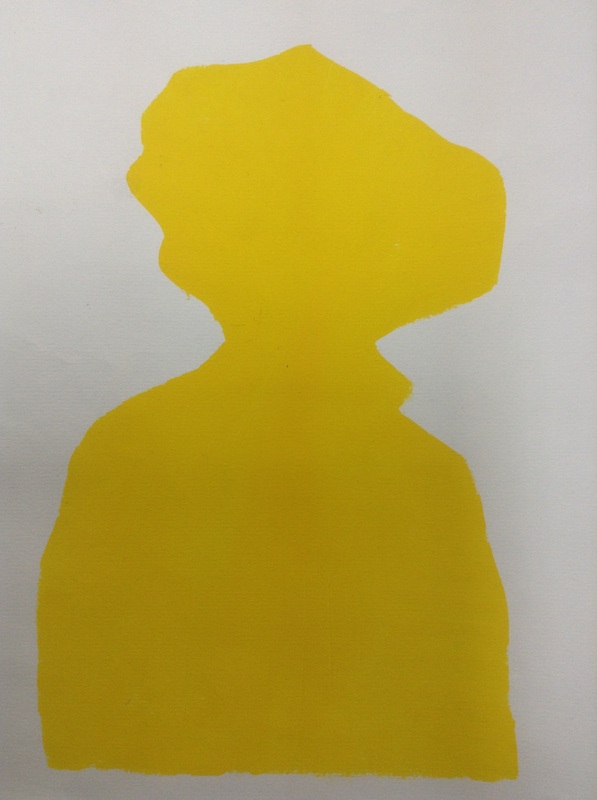
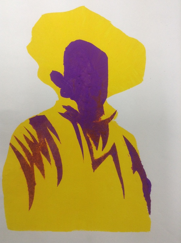
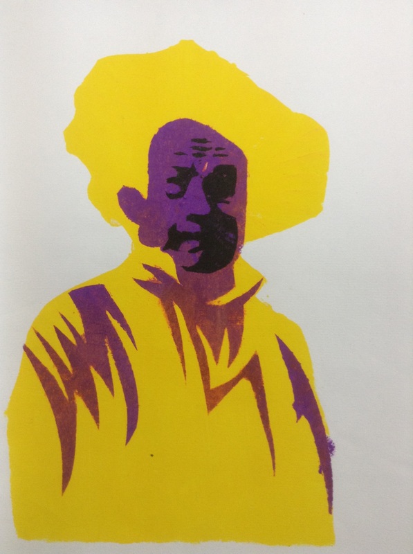
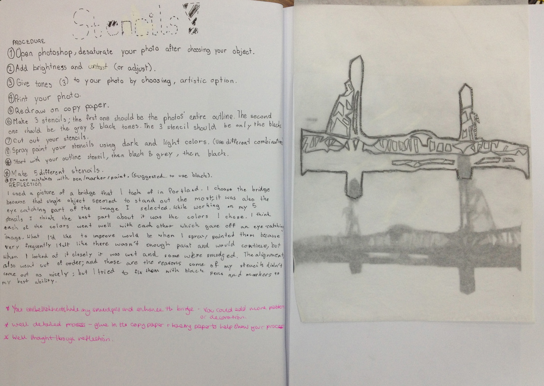
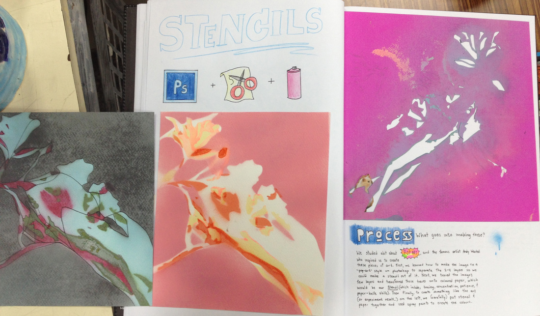
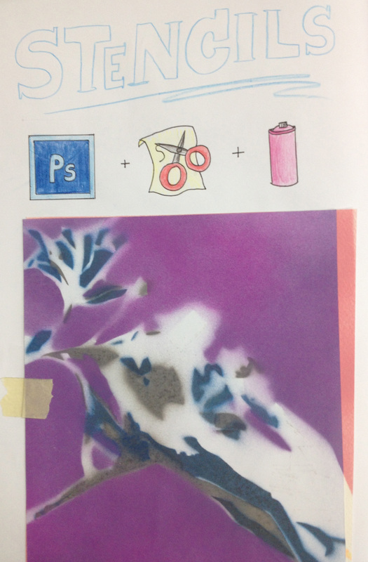
turn your work into a stencil
LO: Identify shapes according to tonal layers
Use a craft knife to cut detailed shapes to make your stencil
Use a craft knife to cut detailed shapes to make your stencil
Before you begin copy your work 3 times and glue it onto 3 pieces of thick paper or card.
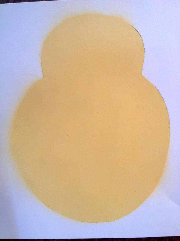
1. Cut away the complete shape, ensuring you have lots of space around the outside
|
2. Next cut away the same area but leave behind the first lightest tone. here you see I have not cut away any white.
|
3. For the final one, cut away only the darkest areas. You can see I have left behind the grey and white
|
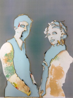
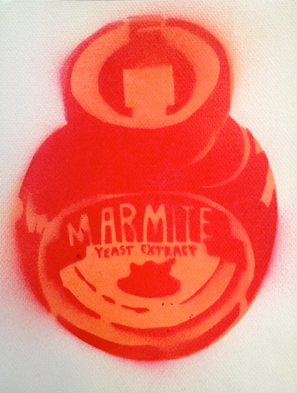
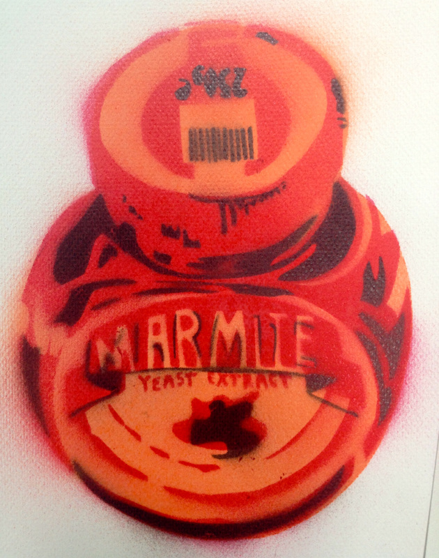
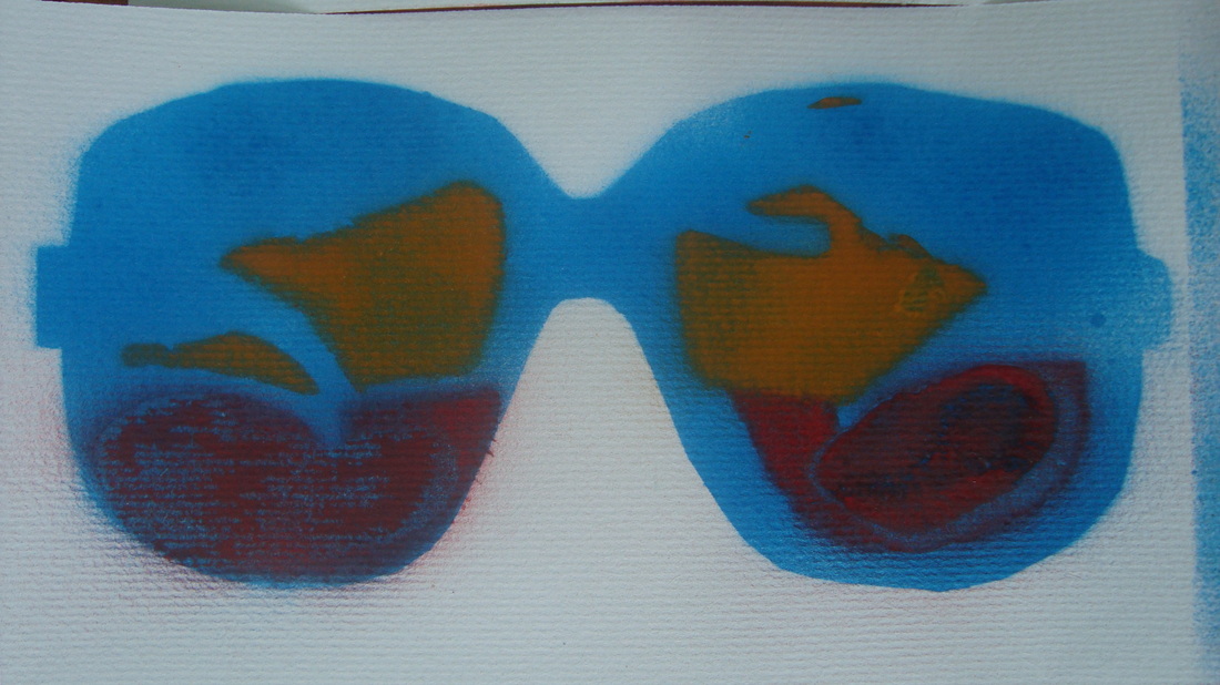
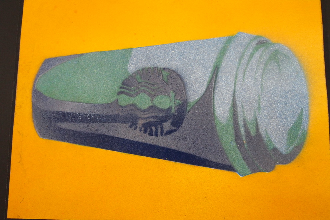
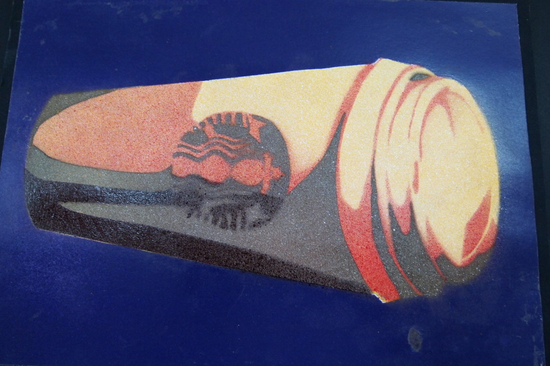
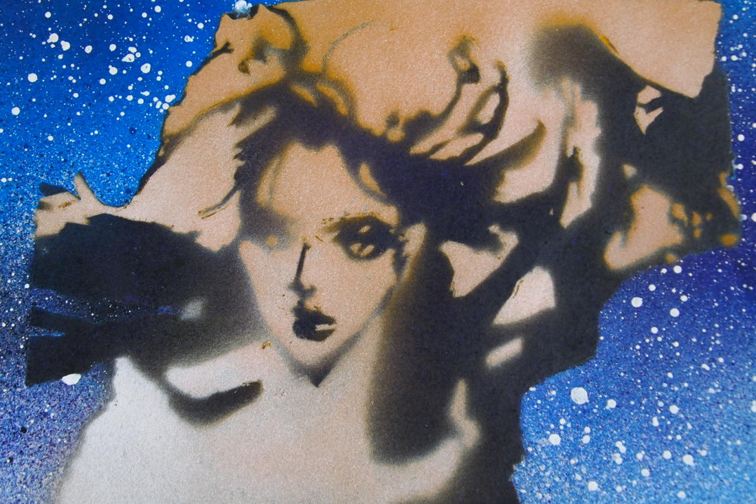
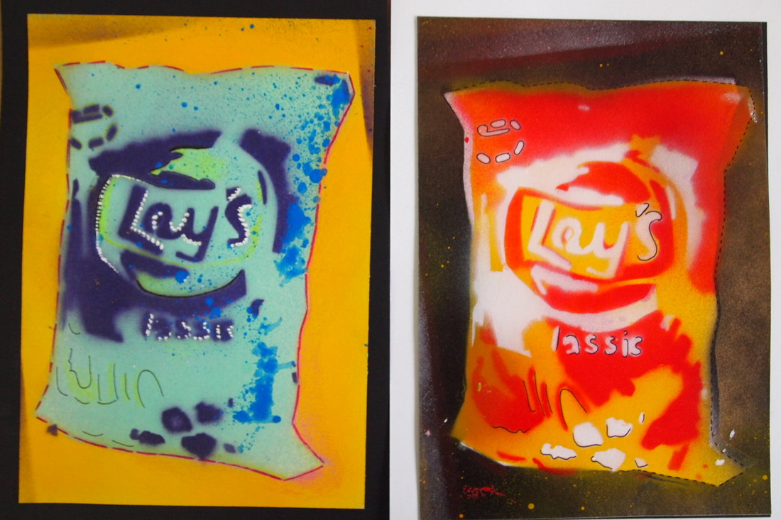
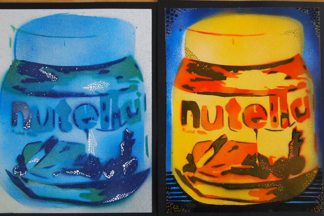
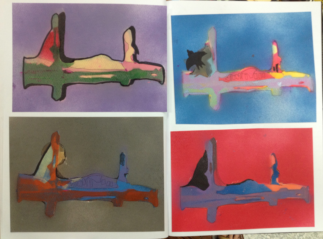
Make a Spray Paint
LO: Experiment with your stencils, applying spray paint to different stencil layers
You will need to use an absorbent material to spray on - water colour paper is good!
You need to build up the layer from the largest to smallest and from the lights colour to the darkest. However, rules are there to be broken, so experiment and have fun!
You need to build up the layer from the largest to smallest and from the lights colour to the darkest. However, rules are there to be broken, so experiment and have fun!
|
|
|
Add some Detail to finish
LO: Evaluate the quality of the sprays and apply embellishments accordingly
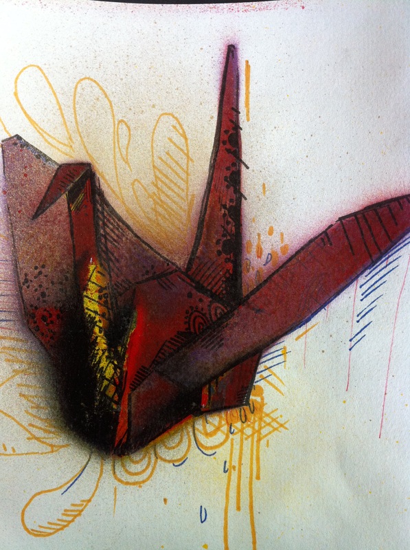
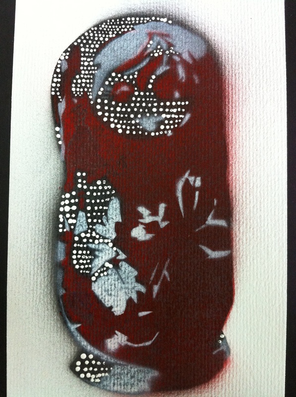
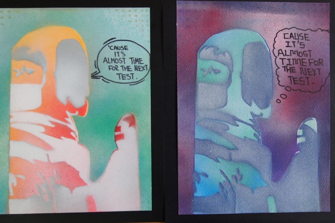
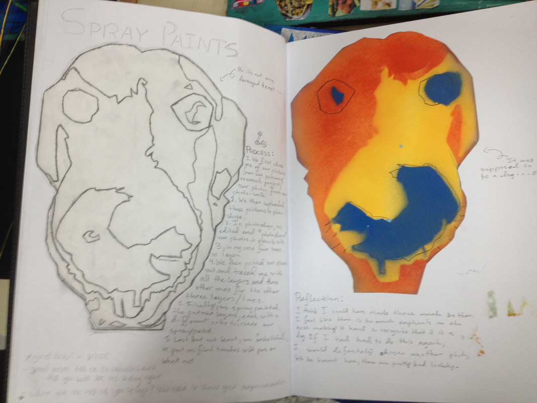
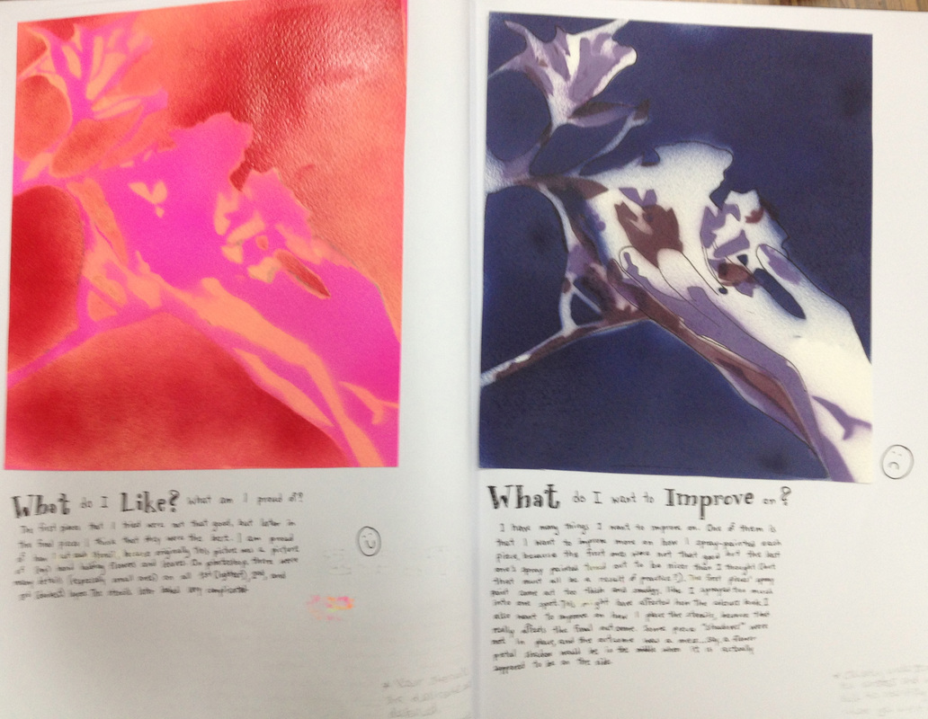
Use black or coloured pen to build in some details and finish your work off nicely. See these student examples below.


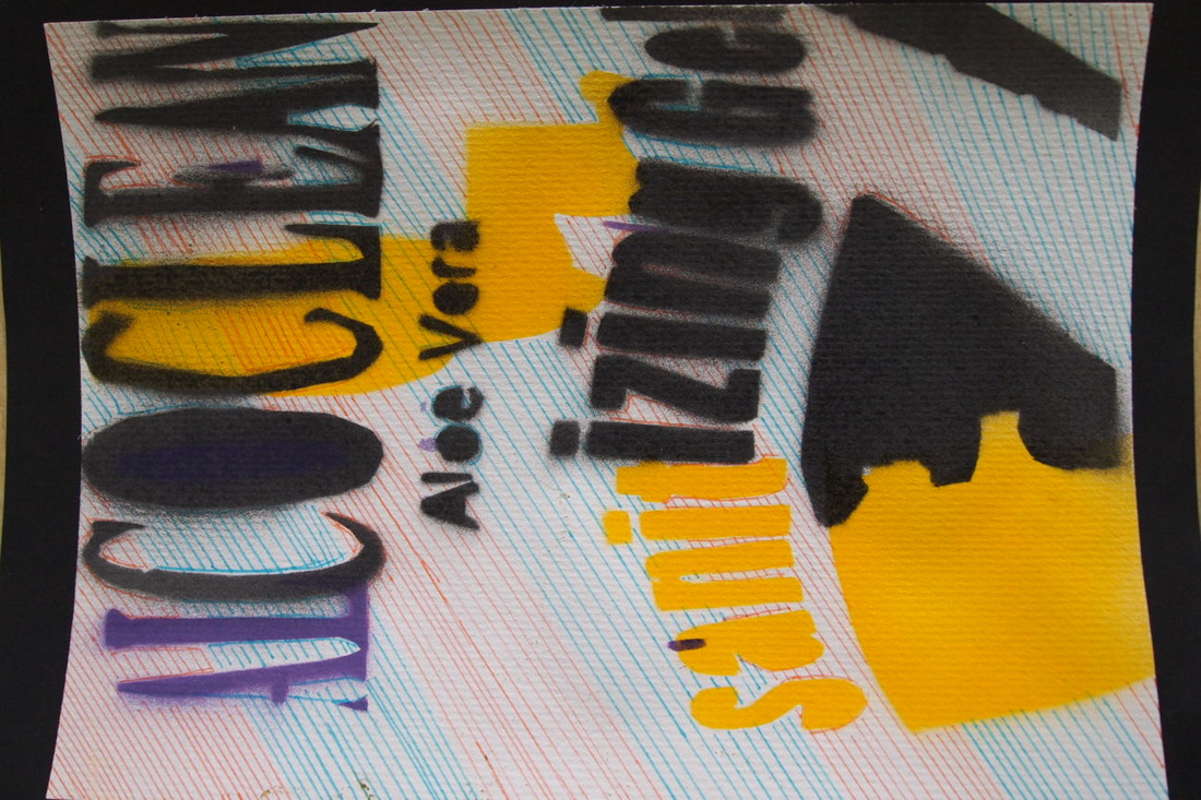


spray paint write-up
1. Choose your best spray paint - write your name on the back and hand to Ms Kay
2. Cut down and glue in your experimental pieces to your sketchbook
3. Write up the process
- How did you make the stencils?
- How did you know what to cut out?
- How did you spray?
4. Reflection -
-Which was your best spray?
-What made it so good?
-Which colours did you like the best and why?
-What didn't work so well and why?
- Do you have any tips for someone else making doing this project?
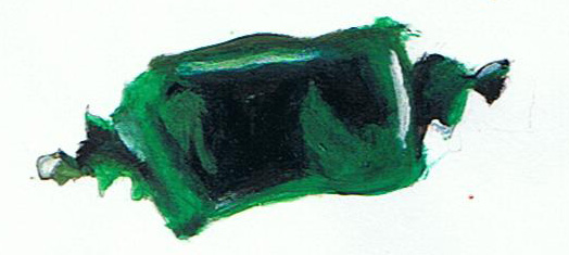
The finished piece


What's your code name?
|
Pablo Picasso
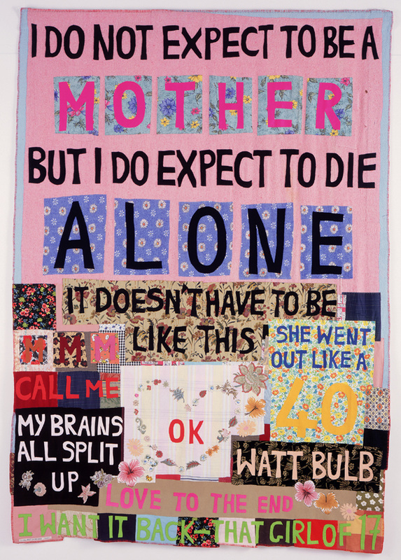
Tracey Emin
|
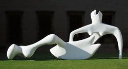
Henry Moore
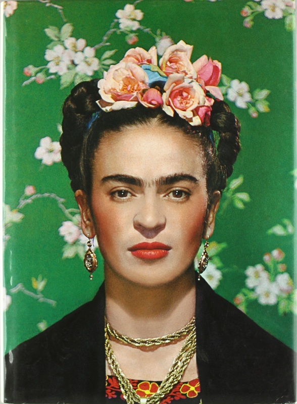
Frida Kahlo
|
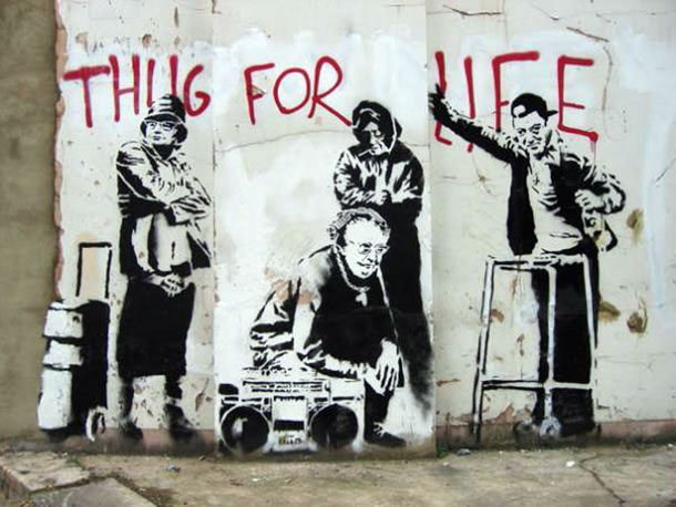
Banksy
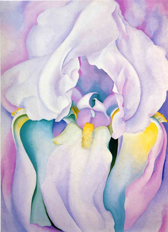
Georgia O'Keefe
|
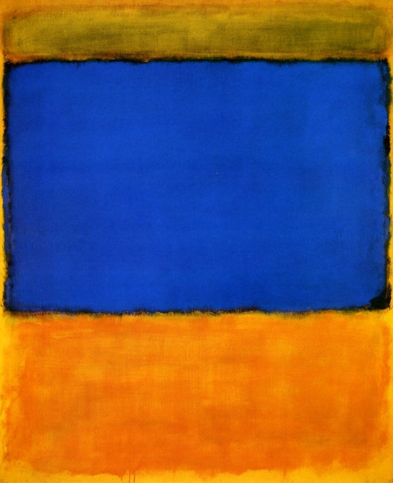
Mark Rothko
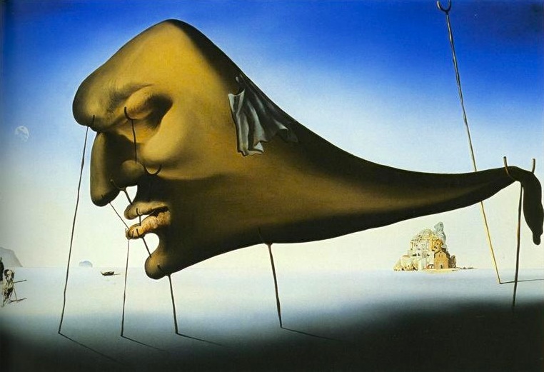
Salvador Dali
|
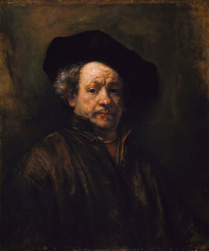
Rembrandt
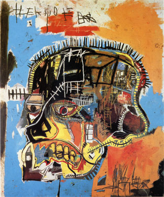
John Michel Basquiat
|
