Objectives:
· Create a collage that documents objects that have importance to you, using layering techniques, juxtaposition, emphasis and colour.
· Create a collage that documents objects that have importance to you, using layering techniques, juxtaposition, emphasis and colour.
In the project you will:
- Observationally study, drawing an object of your choice, applying tone and texture
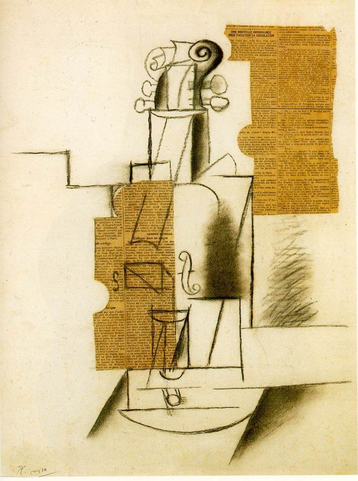
- Complete an artist research page on Picasso
- Understand the history and concept of cubism
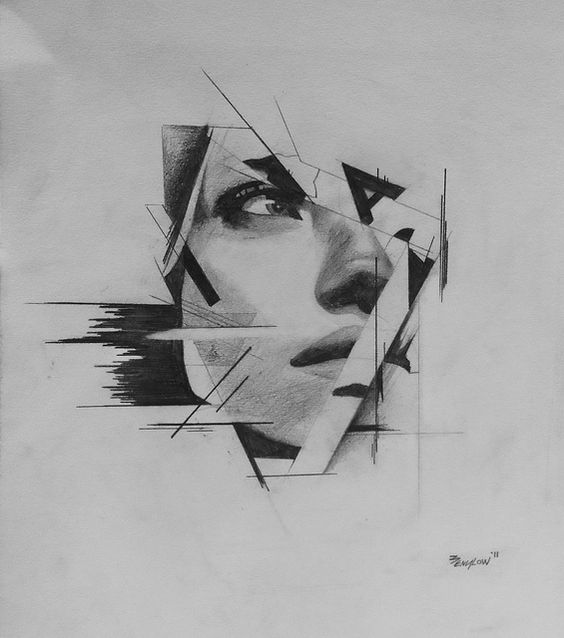
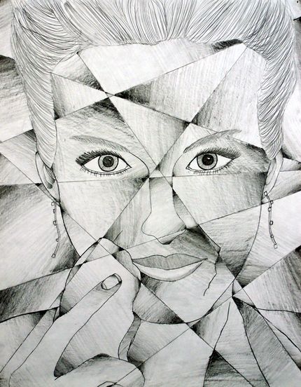
- Drawn from different view points
- Demonstrate and practice fractured planes.
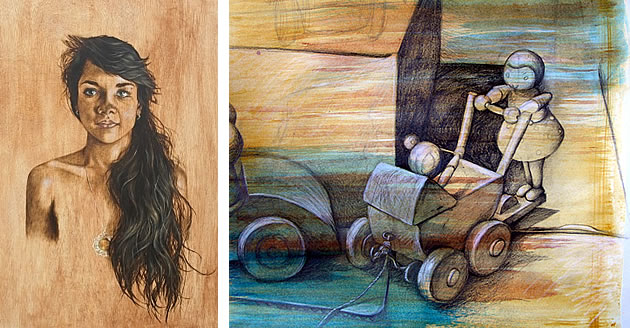
- Choose a color pallet and do a wash
- Experiment with oil pastels on different surfaces, blending colours
- Use collage techniques
- Demonstrate an understanding of positive and negative space
- STUDIO WORK - Use a collection of personal items to build a cubist work that combines; collage, fractured planes, multiple view-points, oil-pastels, charcoal, texture, line and value
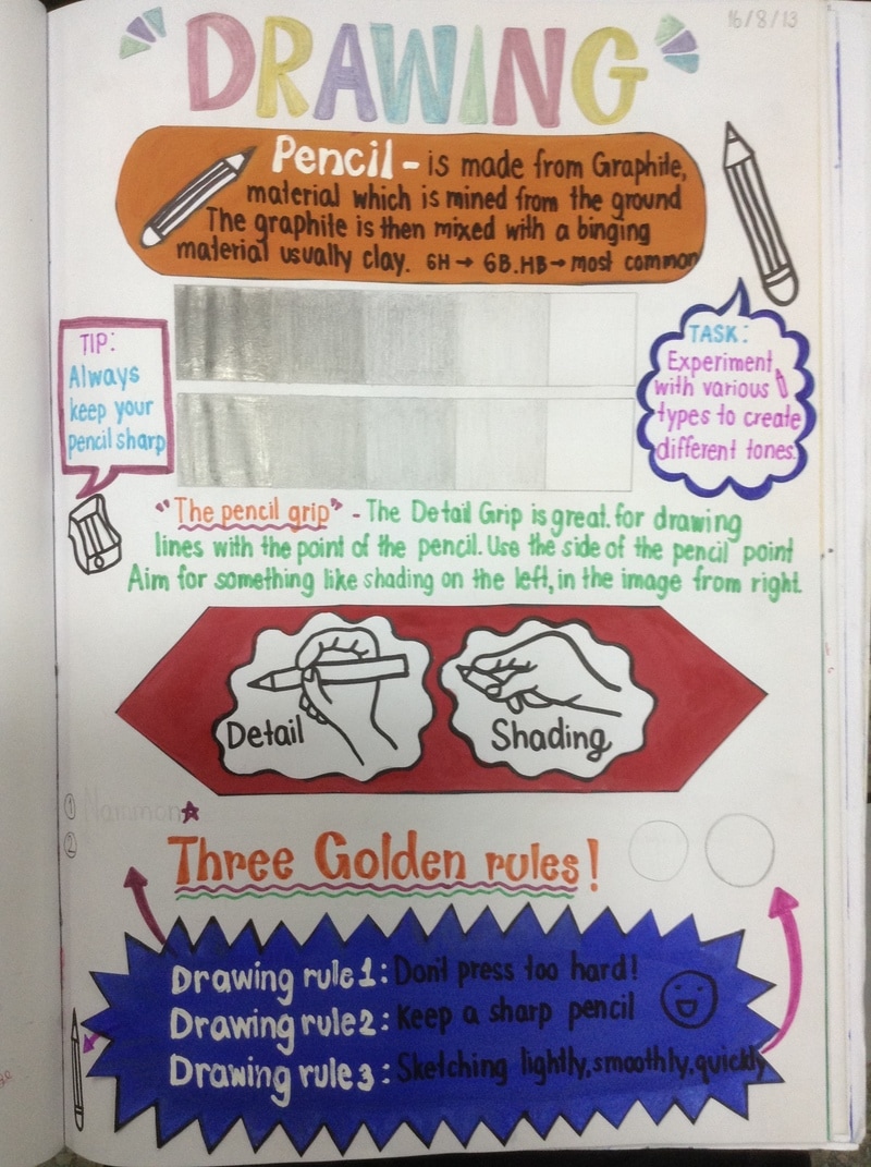
Observational Drawing of a precious object
|
|
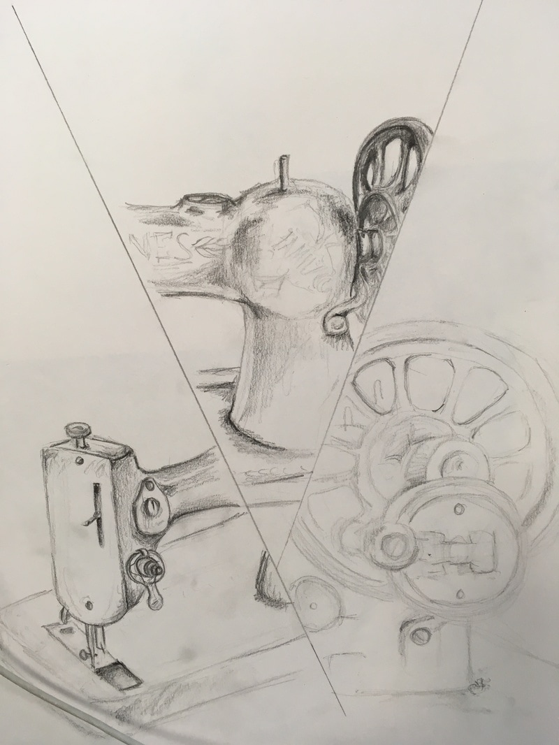
Choose an object or a range of objects that are important to you.
Draw two lines across your page. At this early stage, they must not touch. Draw a third of this object in as much detail as possible into one section of the page. Use pencil and include tones, shadows and highlights. If you are using a range of objects arrange them clearly together.
Next, change where you are sitting and draw another third of the object from a different angle, it's okay to draw some of the same parts and it's okay if they don't meet up.
Finally repeat, moving again, for the final section.
Picasso Research
emphasis + juxtaposition
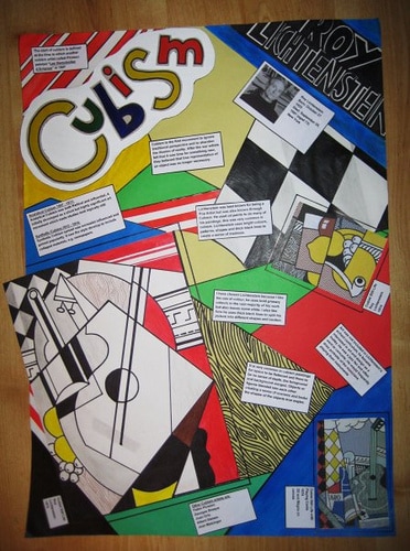
Art Movement Research: Investigate the at movement Cubism. Write down the key points from the ppt. Written information should be your own words. Your entries should include both the facts and the feelings and thoughts – what ideas do they give you? How can you use (or reject) the information or ideas and why? What is the function and significance of the artwork? How do you think Picasso influenced other artists?
Homework: Choose an art work by any of the previously mentioned artists:
- Pablo Picasso
- George Braque
- Juan Gris
- David Hockney
- David Mach
Analyse:
Form
1. What is the mood of the painting?
2. What is your initial reaction to it?
3. How has the artist utilized the elements of composition line, texture, space, color and shape to create this mood, or establish the content of the work?
4. How would you describe the line quality? sharp? fuzzy? broken?
5. How would you describe the brushwork?
6. What is the focal point? How do you know?
7. How would you describe the texture?
8. Describe the colour and contrasts in the composition.
9. Are natural colours used by the artist?
10. Is there an overall colour theme or tonality used?
11. Has the artist used dramatic light and dark lighting effects, much like stage lighting?
12. Where are you the viewer in relationship to the painting?
13. What objects or figures you see? are they clear and distinct?
14. Are the shapes biomorphic? organic? geometrical?
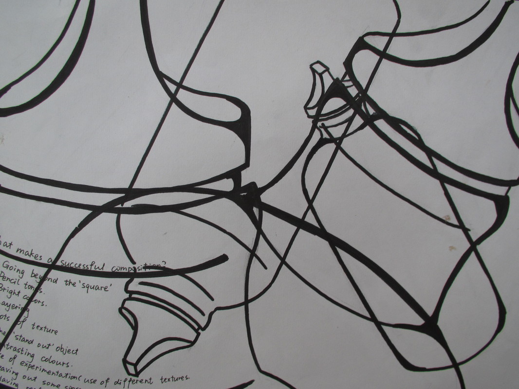
Rule of thirds for good composition
making that Final Piece
1. After reviewing Cubism, you need a ruler, newsprint, pencil and eraser. Have a group of objects set up in the room for a still life. You might like to use the same things Picasso and Braque used such as guitars, wine bottles, fruit, violins, trumpets, etc. but are they contemporary and reflect today's world
2. Begin with a few straight lines on the newsprint, some vertical, some horizontal and some diagonal (about five to start). Think STYLIZATION and SIMPLICATION of form into to flat shape.
3. As you start to draw these contours of objects, start at the top and move down the page. When you get to the lines, shift over and continue to draw the object. Add more lines from parts of the objects that you have started. Make at least three studies differing the object used and new lines.
4. Pick out the best design and transfer it to the scrap mat board and this will be the color of the picture.
5. Outline the design with a narrow black pen. Plan out a value pattern using a black felt tip pen.
6. Select at least three areas to collage newspapers or sheet music and use a spray adhesive to glue them down.
7. Use the Palettes and Watercolor Paint to produce a faux wood grain by painting lines, blending with a moistened brush and putting a tone across the area for a light value.
8. Lastly use white and black Charcoal Pencils and Graphite Drawing Pencils to draw into shapes and make gradations where you like.
|
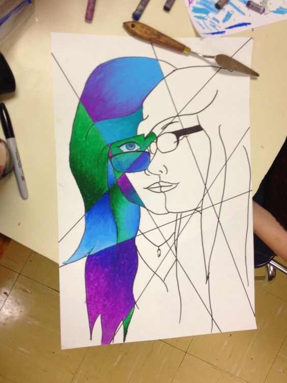
1. Start by adding fracture planes across you work
3. Choose your colour pallet and add a paint wash over your work
6. use pencil to draw in some of the details. Don't forget, detail will bring the viewer eye, so add the most detail to the centre of focus
|
2. Draw an outline of your object/s, partly or whole, into the shapes created by the fracture. Sometimes make your drawing go through the fracture
4. decide and ink in positive and negative areas
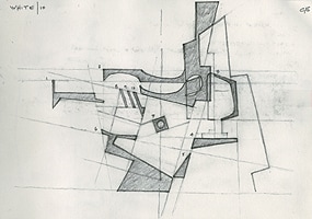
5. Add collaged materials to add a bit more interest to the background
7. Finally, use oil pastels and your chosen colour pallet to blend colour in the remaining gaps
|
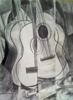
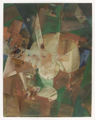
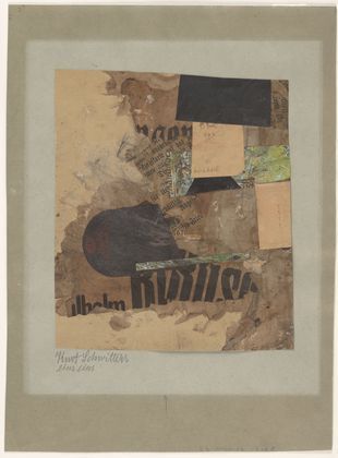
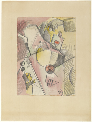
How to build cubist work demo - contour lines and layering
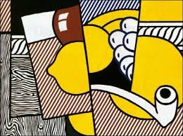
Examples of the end product you ar aiming for
Kurt Schwitters - German - 1887-1948
Choosing a color palette
|
How do you use these 12 basic colors to create harmonies that actually look great?
Use the most simple color schemes like a Monochromatic, or aComplementary Scheme There are also 3 - 4 - and Multi-Color Schemes to try out. Some like Split Complementary or aSquare Tetrad may sound scary but they're really simple once you know how. |
|
Complimentary
When you mix two opposites together anywhere on the Color Wheel, the result becomes increasingly neutral. Blow see Red and Green. quickly the brightness of each gets dulled down. On the bottom row, I've added a little white to demonstrate how you can easily achieve a lovely range of neutrals without using black. YELLOW + VIOLET / PURPLE = WARM GRAY BLUE + ORANGE = COOL BROWN RED + GREEN = WARM BROWN Knowing this little trick with complementary colors is really valuable when you have paint colors that are a touch too bright but you don't want to change them too much. Adding gray (black + white) as we have with other Color Schemes can flatten your color. Instead, by simply adding a tiny drop of the Complement, you can get a more neutral version of the original. 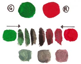
Analogue and a ComplimentaryHere, Violet is selected as the main 'Mother Color'.
On either side of the Yellow directly opposite Violet in theColor Wheel is Yellow/Green and Yellow/Orange. They are shown on the top row. The cleanest, loveliest paint mixtures will be achieved if you mix your own Yellow/Green and Yellow/Orange using the same Yellow for both. By adding a tiny bit of Violet to the two top paint colors you get some interesting results. Violet + Yellow/Green = Olive Violet + Yellow/Orange = Burnt Orange Violet + Yellow/Green + Yellow/Orange = Neutral Brown Notice how the 3 mixtures on the bottom row work so well together. There's never any clashing with this method. Of course you can then alter each of these even further by adding White, Black or Grey. Add more of the three hues too if you begin to lose the color. As long as you stick with the same three and don't add any other Hue, they will always go together. 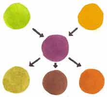
|
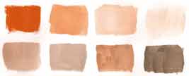
Monocromatic
Take any one of the twelve Hues from the Basic Color Wheel and repeating it in various Tints, Shades and Tones. You would be surprised how many variations, both obvious and subtle, can be achieved from just one color. This monochromatic color scheme approach is actually considered very sophisticated and usually creates a calming effect. here, pure Orange paint and mixed a little of the following pigments to quickly create these eight colors.
Square TetradHere our color palette is Red, Green, Yellow/Orange andBlue/Violet. Notice the two pairs of Complementary Hues.
Red is the dominant Mother Color and placed in the middle. Pure Green, Yellow/Orange and Blue/Violet are shown on the top row. By adding a tiny bit of Red to the three paint colors on the top row, you'll get some interesting results which you can see on the bottom row. The original harshness of the colors harmonize and become a 'family'. If you add more red to each the colors will change even more. Green + a little Red = Dull Khaki Green Yellow/Orange + a little Red = Intense Orange Blue/Violet + a little Red = Burgundy The Neutral Brown in the middle row on the right is a mixture of all four starting colors.There's no guesswork as to which neutral to use, because all these colors are part of a blended family. Even though the mixtures on the bottom row no longer clash, they're still a bit challenging to balance. That intense orange will need to be used in small doses to keep from overpowering the other more subdued mixtures. It will help to add white to lighten, black to darken and grey to tone down brighter paint mixtures a create a broader range of colors. 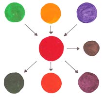
|
