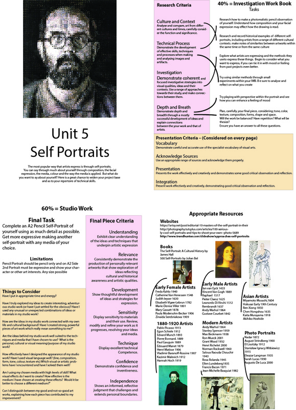
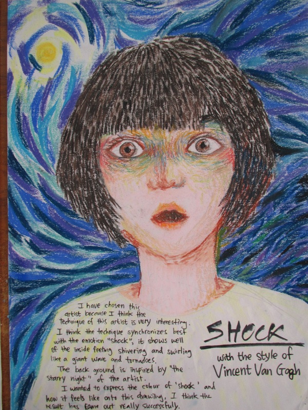
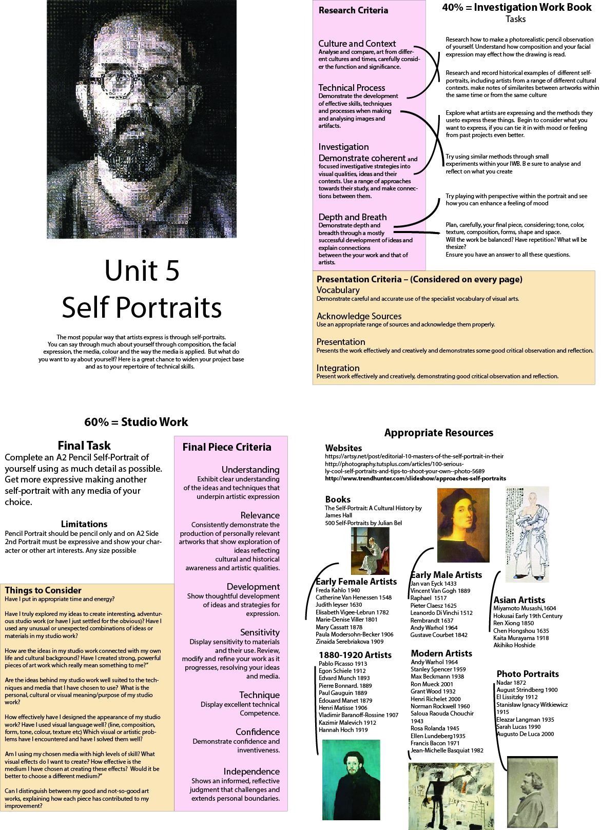
| unit_5_-_self-portrait.jpg |
Composing that portrait


portraits PPt
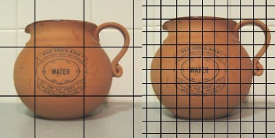
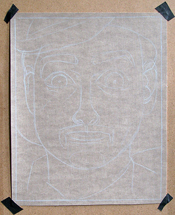
Using a grid to draw your portrait
|
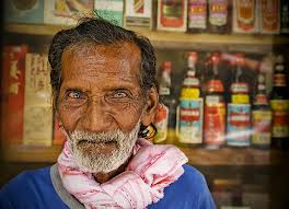
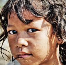
First you'll need the photo you choose printed to A4. Ideally you will need a A3 piece of good quality paper to draw on. You will draw you photo twice as big as it is printed. Draw a grid over the top of the photo. You may choose to draw the grid directly on the photo or if the photo needs to be preserved, you may create the grid on a piece of acetate and place the acetate on the photo. The size of your grid squares will be dictated by the size of the photo. Obviously, the smaller the photo, the smaller the grid squares. On the flip side of this, larger photos would require larger squares. It is essential that you make sure that the grid that you draw on the photo and the grid that you draw on your paper are proportional to each other. If they aren't, then you will have distortion in your drawing.
|
|
|
|
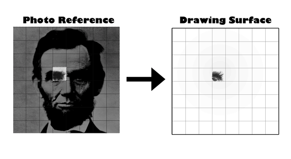
Now you will draw a grid that is proportional to the grid on your photo on your drawing surface. For example, if your photo is 8" by 8" and you have made a grid made of inch squares, your drawing paper could be 16" by 16". A good way of checking to see if your drawing grid matches your photo grid is counting the number of boxes. You should have the same number of boxes on both grids. If you don't, then you've done something wrong.
Next, draw what shapes, lines, and values that you see in each square on the photo to the corresponding square on the drawing surface. Pay special attention to the positive and negative shapes in each square. Try not to think about what object you are drawing. Instead, concentrate on just the shapes, lines, and values. Draw each square and take your time. In the end, you'll find that you've created an accurate drawing from a photo.
Photo graph what you have done and e-mail me the result. I'll give you feedback.


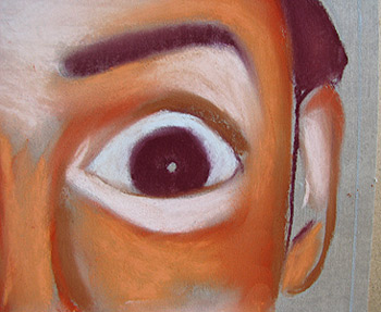
drawing the eyes
|
facial toning
|
Drawing Hands
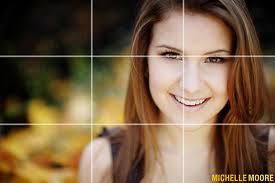
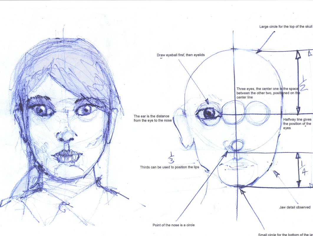
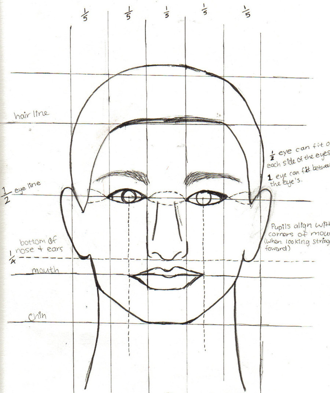
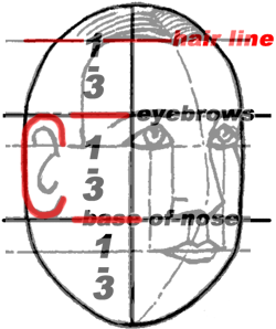
Facial Proportion
|
|
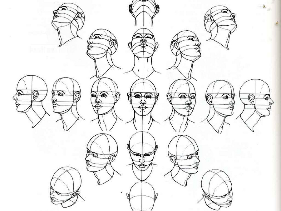
Facial proportion different angles
Using Soft pastels
GCSE development by Joanne Park
3. Add two more colors. The face is starting to take shape.
We're going for "normal" colors. Try to create a fun, funky one that is full of life and color! I want to create a portrait that is whimsical and lighthearted. Don't be concerned about getting the proportions exactly correct or creating an exact likeness of you. Have fun and explore the medium of pastels. 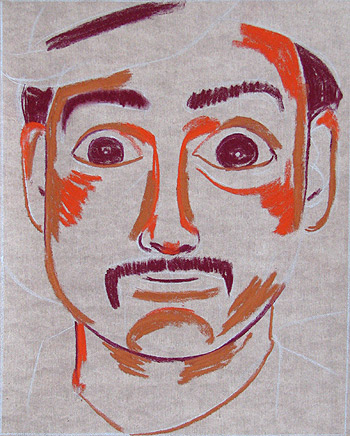
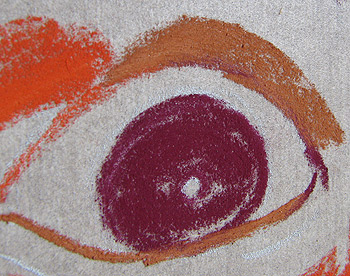
4. Next, add more colors. Still don't blend yet. Take note of how pastel looks when it hasn't been blended. There's a really nice sense of immediacy and energy to pastel that isn't blended.
If you want to, you can create the whole pastel portrait without blending at all. At this point, color side-by-side, rather than doing any overlapping. 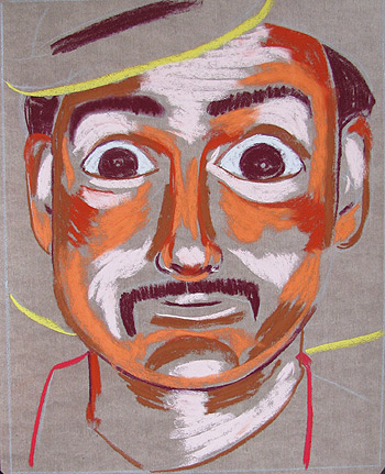
|
1. sketch in the outline of the portrait. The outline should remain clear (and not smudge away) while you fill in the colors with pastel. Drawing your outlines in colored pencil is a good tip when learning how to use pastels.
2. Using a mulberry colored pastel, draw in the darks.Don't want to use black for two reasons:
1. Because black would be too dark for this stage. The goal at this stage is to create a build-up of color. 2. Because black pastels tend to lack depth and look lifeless. Black should only be used sparingly! 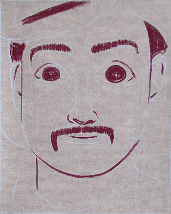
At this point, do not blended the pastel at all. That's for later. Here is an extreme close-up of how the pastel looks on the paper:
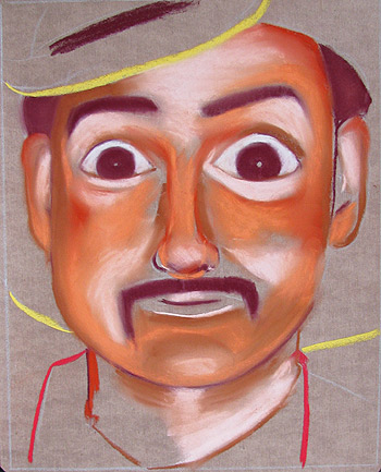
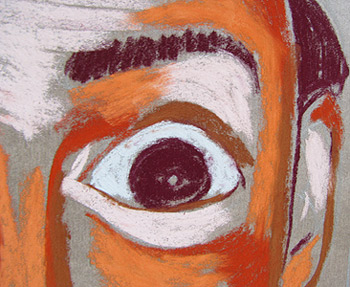
5. Now you can blend the pastels using your finger. See what a difference it makes? Compare the image below with the version above. Pastel painting
TIP: After you blend pastel with your finger, you will need to either wash your hands or use moist cleaning wipes for easy clean up. If you don't clean off your fingers, the pastel that is on your fingers will smudge into whatever color you use next. While blending helps to smooth out the pastel painting, it also loses a sense of raw immediacy and energy. It's my goal now to bring some of that energy back. Compare the two close-ups below to see how the blended pastel looks different from the non-blended pastel:
|
Using Pen and continuous contour
Contours follow the edge of the shapes and can be creates using line. You can jazz it up by making it a continuous line. Look as the examples below to give you some ideas.
For a great demonstration of how to use charcoal click on the link below
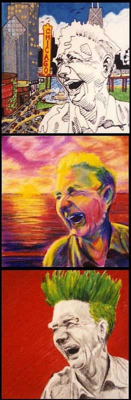
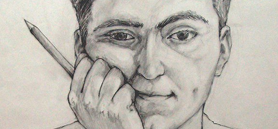
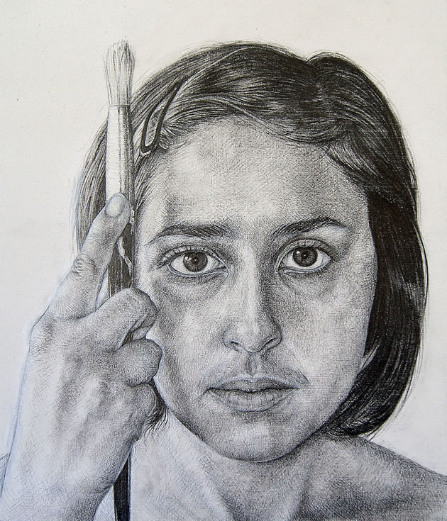
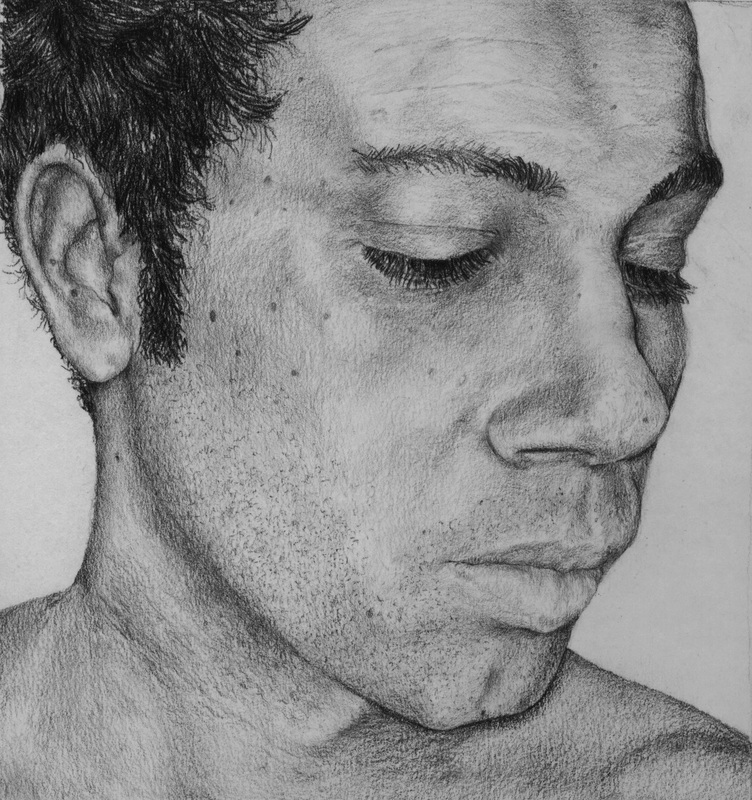
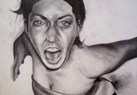
What makes these works expressive?
Review Your Portraits
(You will need to see all 3 portraits to complete this activity)
- What were you trying to express each time? Was it different or the same?
- If the same, how have you expressed this differently each time?
- If different, what technique makes the expression different?
- Which, in your opinion, was the most successful at expressing mood? Why?
- Which was the most successful technically?
- Which portrait was the least successful in conveying expression?
- How could you have made it better?
- Which is the most valuable skill you have learnt over this project?
